Creating a visually appealing presentation is essential for effectively communicating your message and engaging your audience. A well-designed presentation not only captures attention but also enhances understanding and retention of information.
The Importance of Visually Appealing Presentation
A presentation that looks visually appealing will help audiences grasp complicated information they are being presented with, hold their attention for a longer time, and sustain it. A poorly designed presentation will distract from your message and could leave your audience confused and disinterested.
Key Design Elements for a Visually Appealing Presentation
1. Layout and Structure
- Consistency: Maintain a consistent layout throughout your presentation. Use the same fonts, colors, and spacing on each slide to create a cohesive look. Consistency helps the audience focus on the content rather than being distracted by varying styles.
- White Space: Utilize white space effectively to avoid clutter and make your content more digestible. White space, or negative space, refers to the empty areas around text and images. It gives your content room to breathe and helps emphasize important points.
(Use of whitespace to make the product the centre of attention)
2. Fonts
- Font Selection: Choose fonts that are easy to read and appropriate for your audience. Stick to a maximum of two to three fonts—one for headings, one for body text, and possibly one for special emphasis.
- Font Size: Headings should be significantly larger than the body text to create a clear hierarchy.

(Using a Bold Font for the title and a slimmer font for the other text to show hierarchy)
3. Color Scheme
- Harmony: Select a color scheme that complements your content and evokes the right emotions. Use a color palette that aligns with your brand or the theme of your presentation.
- Contrast: High contrast between text and background colors ensures readability. For example, use dark text on a light background or vice versa.
4. Images and Graphics
- High-Quality Visuals: Use high-resolution stock images and graphics that are relevant to your content. Avoid using pixelated or distorted images, as they can make your presentation look unprofessional.
- Visual Hierarchy: Establish a visual hierarchy by using size, color, and positioning to guide the audience’s attention to the most important elements. Large images or bold graphics can be used to highlight key points.

(Use of High-Quality Graphics and Hierarchy to demonstrate a complex slide)
5. Charts and Data Visualization
- Simplify Data: Use charts, graphs, and infographics to simplify complex data. Visual representations make it easier for the audience to grasp trends and comparisons.
- Prioritise Clarity: Avoid overcrowding slides with too much data. Focus on one or two key points per slide and use clear labels and legends.

(Use of Pie Chart to explain rather complex data)
6. Transitions and Animations
- Be Subtle: Use transitions and animations sparingly. Overuse of flashy effects can distract from your content. Opt for subtle transitions that enhance the flow of your presentation without overwhelming the audience.
- Use Animation to draw attention: Use animations to draw attention to specific points or to build information progressively. For example, revealing bullet points one by one can help maintain audience focus.

(Use of Morph Transition to explain each component of a slide)
**
Six Elements Of Slide Design For Presentations
- Shapes: Use shapes to highlight key information, create flowcharts, or guide the viewer’s eye across the slide. They can be used as containers for text, to separate content, or to create visual interest.
- Images: High-quality images can make a slide more engaging and help communicate your message visually. Use relevant images to illustrate points, create emotional impact, or break up text-heavy slides.
- Icons: Icons are great for simplifying complex information and adding visual interest without overwhelming the slide. Use icons to represent ideas, steps in a process, or to support text.
- Fonts: Choosing the right font can significantly affect the readability and tone of your presentation. Use fonts that are clean, professional, and consistent. Limit yourself to two or three fonts to maintain a cohesive look.
- Color: Color can set the mood of your slide and draw attention to key elements. Use a color palette that aligns with your theme or brand, and be mindful of color contrast to ensure readability.
- Formatting: Consistent formatting (alignment, spacing, margins) is key to a polished presentation. Ensure that text, images, and shapes are evenly aligned, and use formatting tools like bullet points and numbered lists to organize information clearly.
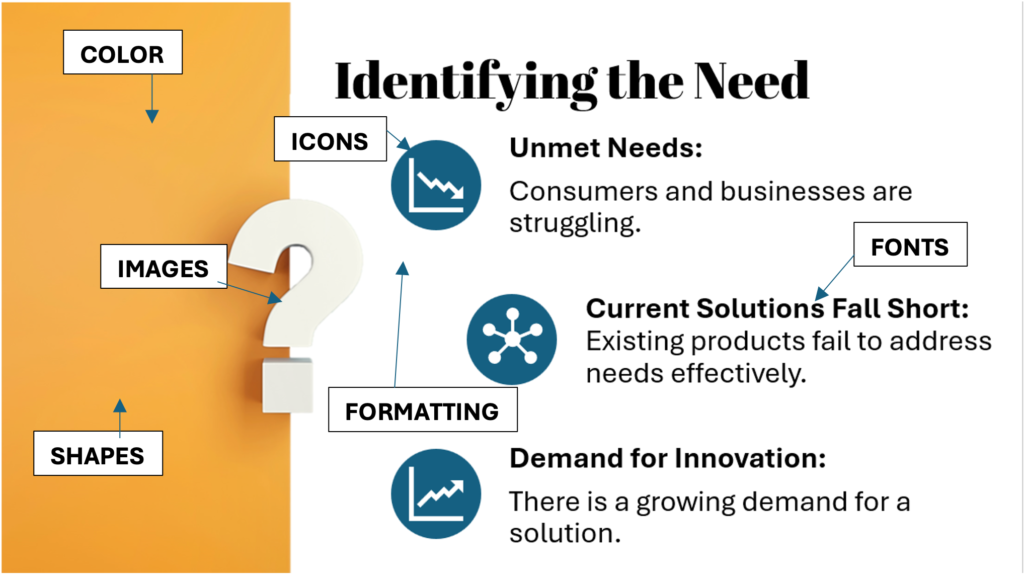
(A slide with all 6 Design Elements)
**
Dos and Don’ts of Presentation Design
Dos
- Keep It Simple
- Aim for simplicity in your design. A clean and uncluttered presentation is more likely to resonate with your audience. Use minimal text, focusing on key points and supporting visuals.
- Use Consistent Branding
- Incorporate your company’s branding elements, such as logos, colors, and fonts, to create a professional and cohesive presentation. Consistent branding helps reinforce your identity.
- Practice Visual Hierarchy
- Create a visual hierarchy by using size, contrast, and positioning to prioritize information. Ensure that your audience can easily distinguish between main points and supporting details.
- Make Use of White Space
- White space enhances readability and makes your slides look polished. It helps to avoid overcrowding and allows your content to stand out.
- Test Readability
- Before finalizing your presentation, test it on different devices and in different lighting conditions to ensure readability. Adjust font sizes, colors, and contrast as needed.
- Tailor to Your Audience
- Consider the preferences and expectations of your audience when designing your presentation. A corporate audience may appreciate a more formal design, while a creative audience might enjoy a more playful approach.
Don’ts
- Overload Slides with Text
- Avoid cramming too much text onto a single slide. Dense blocks of text are difficult to read and can overwhelm your audience. Aim for bullet points or short sentences that convey the essence of your message.
- Use Too Many Fonts or Colors
- Overuse of fonts and colors can make your presentation look chaotic. Stick to a consistent color scheme and a limited number of fonts to maintain a cohesive design.
- Rely on Stock Templates
- While stock templates can be convenient, they may not always align with your brand or message. Customize templates to reflect your unique style and content, or create your own design.
- Ignore Alignment and Spacing
- Poor alignment and inconsistent spacing can make your presentation look unprofessional. Use gridlines and guides to ensure that elements are properly aligned and spaced.
- Use Low-Quality Images
- Low-quality images can detract from your presentation’s overall impact. Always use high-resolution images that are relevant to your content.
- Overuse Animations and Transitions
- Excessive use of animations and transitions can be distracting and may disrupt the flow of your presentation. Use these elements sparingly and only when they enhance your message.
**
Examples of Visually Appealing Presentation
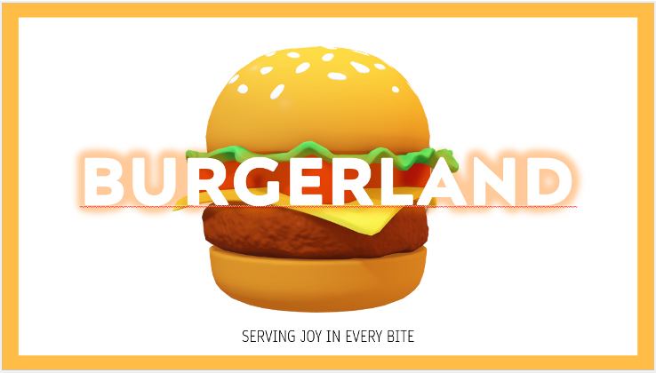
1.Cover Slide: Crafting a visually appealing slide using images and shapes to enhance its graphic design.
2. Agenda Slide: Designing a notebook-style slide by incorporating elements like background formatting, shapes, lines, and images.
3. Text Slide: Transforming a plain text slide into a vibrant one by incorporating designed images, bullet points, icons, shapes, and PowerPoint’s customization features.
4. Smart Art Slide: Elevating a simple slide with SmartArt, complemented by images and additional design elements for a polished look.
5. Chart Slide: Utilizing the Designer Tool to quickly turn your slide from basic to stunning.
Conclusion
Creating a visually appealing presentation requires careful consideration of design elements, audience needs, and the content you wish to convey. By following the guidelines outlined in this blog, you can craft a presentation that not only looks great but also effectively communicates your message. Remember to keep it simple, consistent, and audience-focused, and your presentation is sure to leave a lasting impression.