
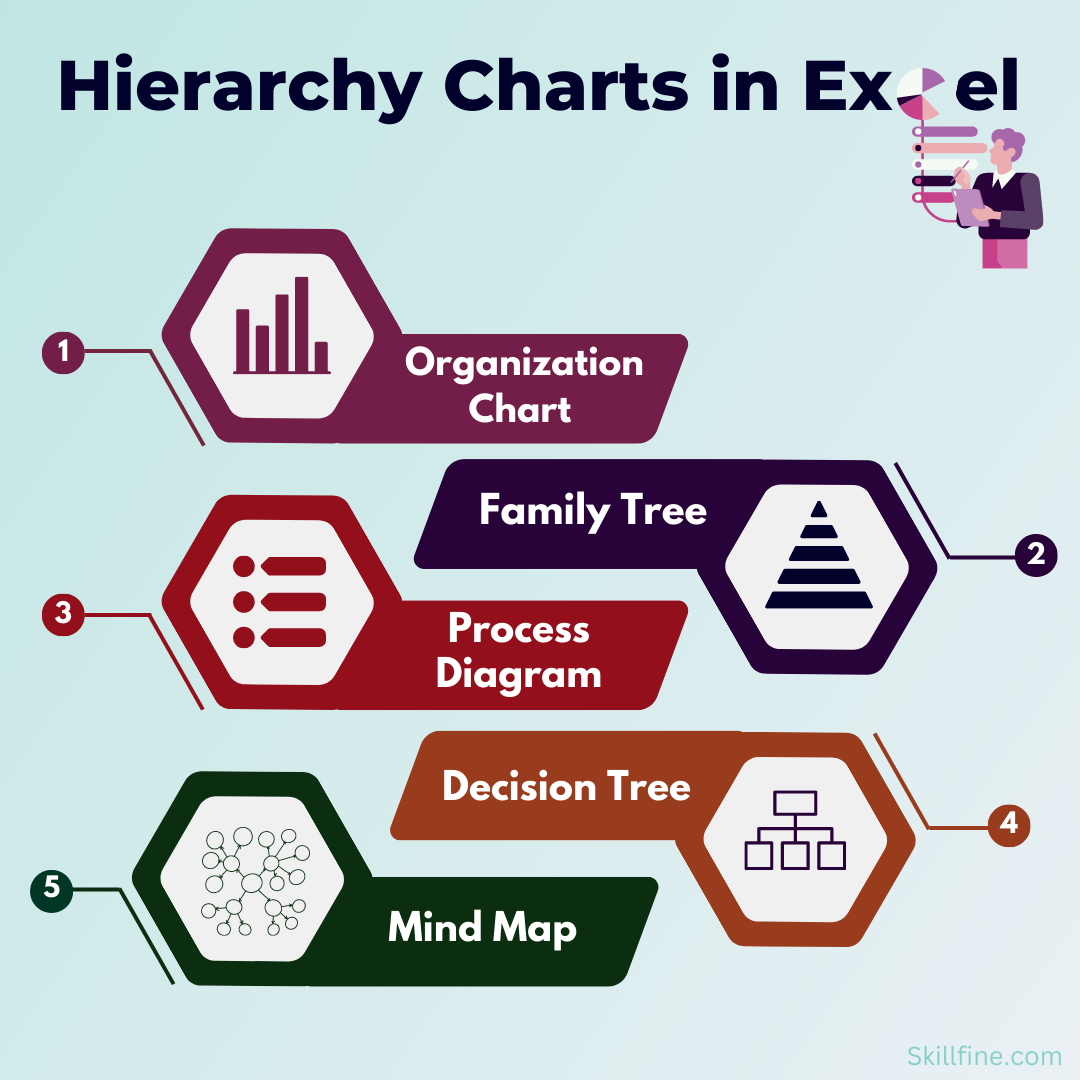
What is a Hierarchy?
Hierarchy charts refers to different levels within a system. In an organization, hierarchy means the different levels at which people within the organization operate (juniors, mid-level and senior level).
In this article we are not discussing about hierarchy of an organization or creation of an organization chart. We will discuss two charts which were introduced in Microsoft Excel 2016. These two charts are known as hierarchical charts as they represent different levels of segmentation within the data set. These charts are known as.
- Tree Map Chart
- Sunburst Chart
Tree Map Chart
A tree map chart is a hierarchical chart. It is used for visualization of data with multiple levels of segmentation.
A tree map chart gives a pictorial representation of how data is spread across different segments and sub-segments. The top categories in the data set are represented by larger rectangles having different colors. The sub-categories within the data are shown in smaller rectangles. Their size represents the contribution to the larger rectangle.
Let us look at a simple example.
Here is a table showing revenues of different categories of electronic products in different countries.

Lets first organize the data for our Tree Map chart.

The table above has countries in one column, the products in the other and revenues in the 3rd column.
To insert the Tree Map chart, Click on the data table, Then Click on the insert tab. In the chart section, Click on Insert Hierarchy Chart. Then Select Tree Map Chart.

You get the Tree Map chart.

In this chart, the larger rectangles represent the countries, and the smaller ones represent the products. Size of the smaller rectangles represent their contribution to the larger rectangle.
Let us format the chart.
- Remove the chart title.
- Remove the legends.
- Remove chart border.
- Format data labels.
- Format the labels – Click on the chart and then right click it. Select Format Data Series from the available options. You get the following options.

Select the option Banner. The added labels are in Grey Color. Change the color of the banners based on the color of the rectangles.
You get the formatted chart (shown below).

If you want to change the design or color scheme of the chart, just click on the chart and go to the Chart Design tab and select from a list of available chart designs. Also, you can change the colors by selecting the change Colors drop down.

Sunburst Chart
A Sunburst chart is an inbuilt chart in Microsoft Excel 2016 and later versions. Like the Tree Map chart, a Sunburst chart is also used to display Hierarchical data, but in a circular format. It is another great way to show relational data in a compact form.
In this chart, each level of hierarchy is represented as a ring. The chart can be used to visualize the contribution made by each sub-segment in a data set.
Let us understand how to create a Sunburst chart with the help of a simple example.
Here is the data which we used in our previous example. The first column represents the countries, the second the product and the third column the revenue contribution by each product.
To insert a Sunburst Chart, click on the data table. Then go to insert, and within the chart section click on Insert Hierarchy Chart. From the drop down select Sunburst Chart.
Once you make the selection, you get a Sunburst chart (as shown below). The inner circle represents the countries and the outer circle the revenue contribution by each product.

Format the chart as per the requirement. Insert a Chart title in the white space at the middle of the inner Circle.
You have your hierarchical chart.

Both the Sunburst and Tree Map chart are useful when the data set has multiple levels of segmentation. It gives you a pictorial representation of how the data is spread across different segments.
Limitations
- These Charts cannot be used if the data set cannot be divided into segments and sub segments meaning that the data is not hierarchical.
- They also cannot be used if we want to see the time pattern for multiple variables in a data set.
In general, visualization of data analysis is a great way to tell a story to the audience effectively. There are a wide variety of Excel charts that can aid us significantly in this process.
Keep Learning and Have Fun.


41 thoughts on “Hierarchy Charts in Excel: Tree Map and Sunburst”
[…] options to tweak the color and design of each chart to your liking. You can also consider using hierarchy charts in Excel to take your skills to the next […]
[…] σας. Μπορείτε επίσης να εξετάσετε τη χρήση γραφήματα ιεραρχίας στο Excel για να ανεβάσετε τις δεξιότητές σας στο επόμενο […]
[…] way to accomplish this is with a hierarchy chart. A hierarchy chart compares two or more data points and presents the results at the top of the chart, below which are […]
… [Trackback]
[…] Find More on to that Topic: skillfine.com/hierarchy-charts-in-excel/ […]
… [Trackback]
[…] Find More Information here on that Topic: skillfine.com/hierarchy-charts-in-excel/ […]
… [Trackback]
[…] Read More Information here on that Topic: skillfine.com/hierarchy-charts-in-excel/ […]
… [Trackback]
[…] There you can find 43864 additional Info on that Topic: skillfine.com/hierarchy-charts-in-excel/ […]
… [Trackback]
[…] There you will find 67890 more Info to that Topic: skillfine.com/hierarchy-charts-in-excel/ […]
… [Trackback]
[…] Find More on that Topic: skillfine.com/hierarchy-charts-in-excel/ […]
… [Trackback]
[…] Find More Info here on that Topic: skillfine.com/hierarchy-charts-in-excel/ […]
… [Trackback]
[…] Read More Info here on that Topic: skillfine.com/hierarchy-charts-in-excel/ […]
… [Trackback]
[…] Here you will find 13684 more Info on that Topic: skillfine.com/hierarchy-charts-in-excel/ […]
… [Trackback]
[…] Info to that Topic: skillfine.com/hierarchy-charts-in-excel/ […]
… [Trackback]
[…] Here you will find 33732 more Info to that Topic: skillfine.com/hierarchy-charts-in-excel/ […]
… [Trackback]
[…] Here you will find 44961 additional Information on that Topic: skillfine.com/hierarchy-charts-in-excel/ […]
… [Trackback]
[…] Read More here on that Topic: skillfine.com/hierarchy-charts-in-excel/ […]
… [Trackback]
[…] Read More Info here to that Topic: skillfine.com/hierarchy-charts-in-excel/ […]
… [Trackback]
[…] Information on that Topic: skillfine.com/hierarchy-charts-in-excel/ […]
… [Trackback]
[…] Find More Info here to that Topic: skillfine.com/hierarchy-charts-in-excel/ […]
… [Trackback]
[…] Find More Info here on that Topic: skillfine.com/hierarchy-charts-in-excel/ […]
… [Trackback]
[…] There you will find 27878 additional Information to that Topic: skillfine.com/hierarchy-charts-in-excel/ […]
… [Trackback]
[…] Find More to that Topic: skillfine.com/hierarchy-charts-in-excel/ […]
… [Trackback]
[…] Here you can find 95275 additional Info on that Topic: skillfine.com/hierarchy-charts-in-excel/ […]
Awesome article post.Really looking forward to read more. Want more.
Your point of view caught my eye and was very interesting. Thanks. I have a question for you.
It?¦s actually a great and helpful piece of info. I am happy that you just shared this useful information with us. Please keep us informed like this. Thank you for sharing.
I am often to blogging and i really appreciate your content. The article has really peaks my interest. I am going to bookmark your site and keep checking for new information.
Can you be more specific about the content of your article? After reading it, I still have some doubts. Hope you can help me.
Your article helped me a lot, is there any more related content? Thanks!
The official platform of Gate.io offers secure and efficient digital asset trading services.
860443 169744very good day, your site is really unquie. Anways, i do appreciate your function 312235
498298 669710I basically could not go away your web site prior to suggesting that I truly enjoyed the standard information an individual supply to your visitors? Is gonna be again continuously as a way to look at new posts 672019
Your point of view caught my eye and was very interesting. Thanks. I have a question for you.
I read this article fully about the resemblance
of newest and preceding technologies, it’s remarkable article.
801988 565114I want to thank you for the excellent post!! I definitely liked every bit of it. Ive bookmarked your internet internet site so I can take a look at the latest articles you post later on. 728452
687056 404378This plot doesnt reveal itself; it has to be explained. 195148
Can you be more specific about the content of your article? After reading it, I still have some doubts. Hope you can help me.
70541 935333As soon as I discovered this website I went on reddit to share some with the love with them. 386095
146992 780868Hi this really is somewhat of off subject but I was wondering if blogs use WYSIWYG editors or in case you have to manually code with HTML. Im starting a blog soon but have no coding knowledge so I wanted to get guidance from someone with experience. Any support would be greatly appreciated! 94498
333037 602075of course like your web-site even so you need to check the spelling on quite some of your posts. A number of them are rife with spelling issues and I to locate it quite bothersome to inform the reality however Ill surely come back again. 30595
Wow, this piece of writing is nice, my younger sister is analyzing these kinds of things, thus I am going to convey her.