Formatting charts in Excel offers robust features for creating visual representations of data by adding charts and graphs. These graphical visual aids not only simplify the interpretation of complex datasets but also enhance the overall presentation, making data more accessible and understandable.
Charts and graphs serve as powerful tools to highlight trends, patterns, and key data points, facilitating informed decision-making and strategic planning. Whether you’re comparing sales figures across regions, tracking performance over time, or summarizing large datasets, visual elements can transform raw numbers into meaningful insights.
Inserting Charts in Excel
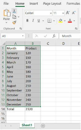
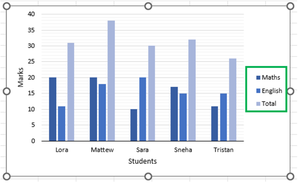
1. Select Data: Highlight the data range you want to include in your chart.
Pro tip: Exclude the total at the bottom to avoid skewing the chart.
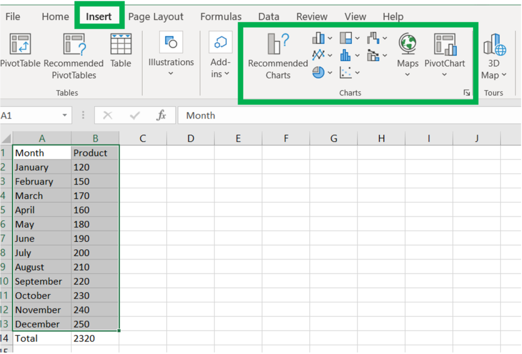
2. Go to the Insert Tab: Click on the Insert tab at the top of Excel.
3. Choose a Chart Type: In the Charts group, you can either select a specific chart type or click on Recommended Charts to see what Excel suggests based on your selected data.
4. Select a Recommended Chart: In the Insert Chart dialog box, you’ll see various chart options. For example, Excel might recommend a line chart for this data. You can preview the chart on the right.
5. Explore Different Chart Types: Click on the All Charts tab to view over 17 different chart types and their variations. Commonly used types include column, line, pie, and bar charts.
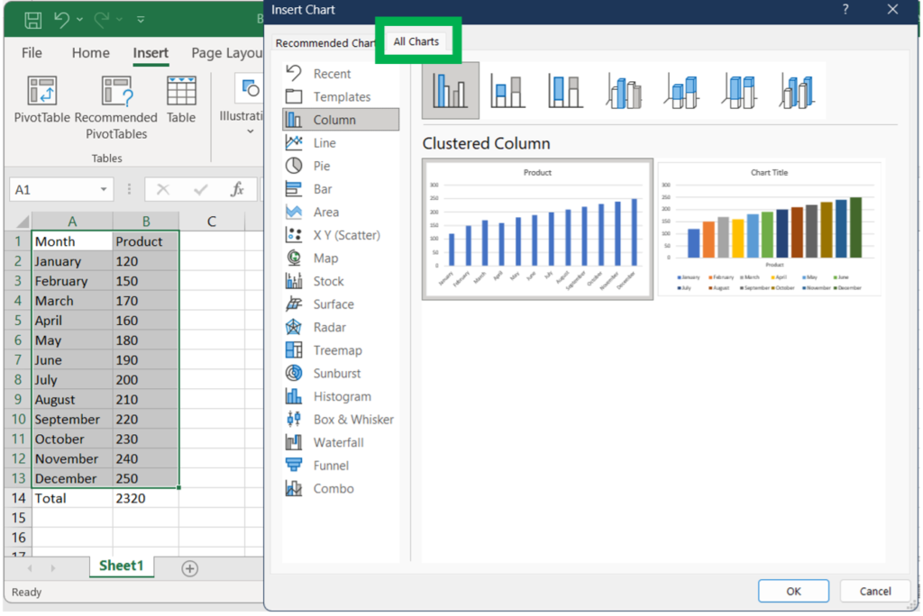
6. Insert the Chart: After selecting the chart type that best represents your data, click OK to insert it into your worksheet.
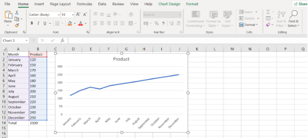
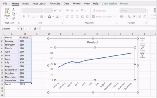
(The chart selected here is “Line Chart”)
**
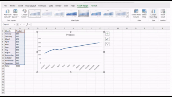
To Adjust the data, click on the table you will notice the table highlights, simply drag the table up and down to toggle the data visible on the chart. See the video illustration below:
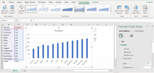
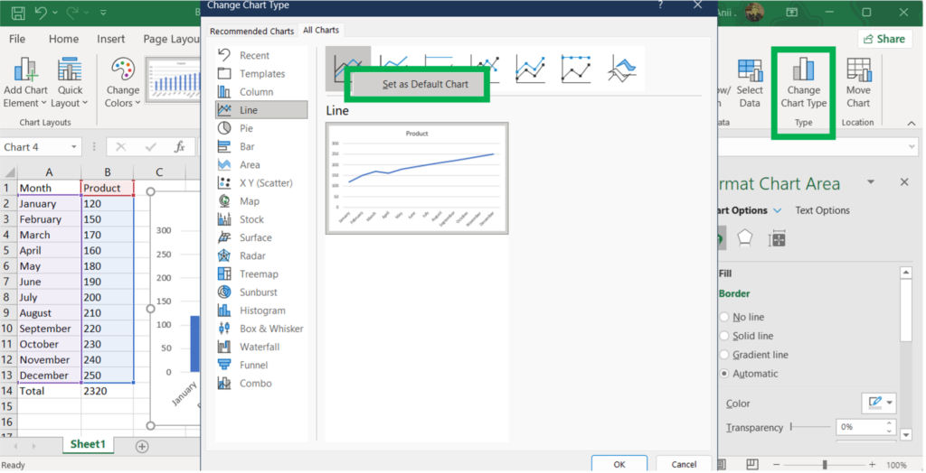
To change the chart, click on the chart and navigate to Type Group and click on Change Chart Type and select your desired chart. See video illustration below:
***
Shortcuts to Insert Charts in Excel
1. Select Data: Highlight the data range you want to include in your chart.
2. Press Alt + F1
3. By default, using that shortcut key combination inserts a column chart. Let say, instead of a column chart, you want a line chart. Let’s click on line chart, right-click on it, and set that as the default chart. then click on okay, and this has now changed it to a line chart. And using Alt + F1 again will now display Line Chart.
**
Insert Charts in a separate Excel worksheet
1. Select Data: Highlight the data range you want to include in your chart.
2. Press F11. (This is now on its separate worksheet, and it’s not alongside the data.)
***
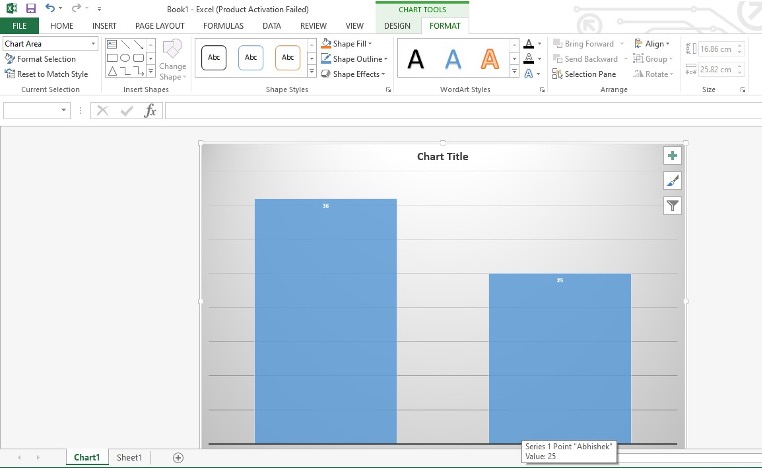
Quick Access Tools to Format Charts in Excel
The quick access tools beside a chart in Excel are a set of convenient icons that appear when you select a chart. These tools provide quick and easy access to some of the most commonly used chart customization options.
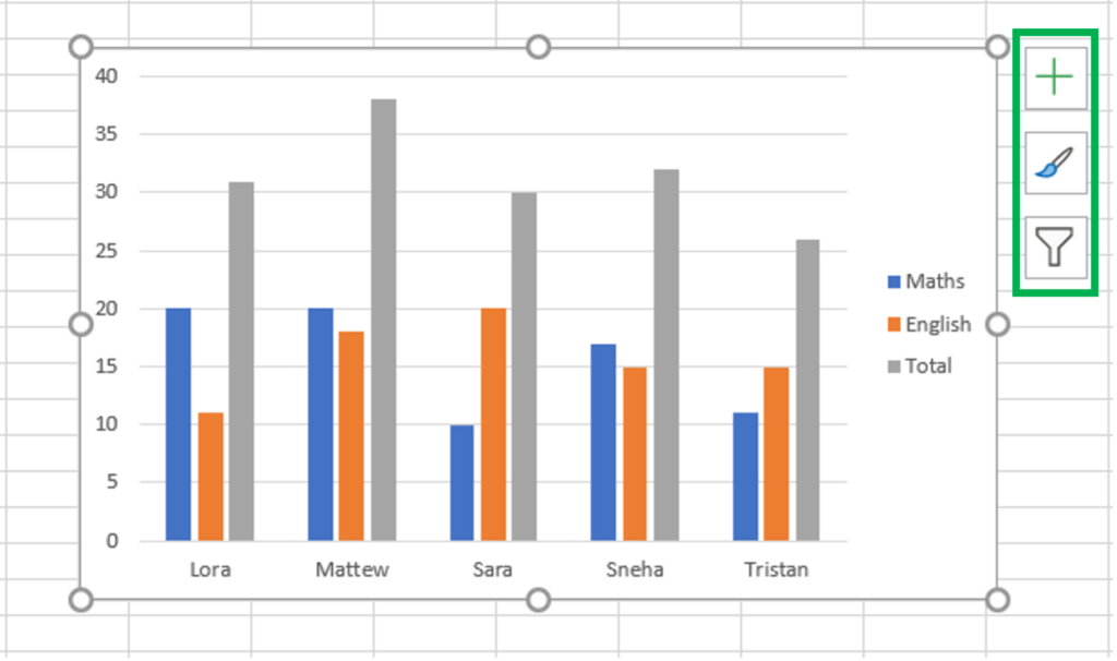
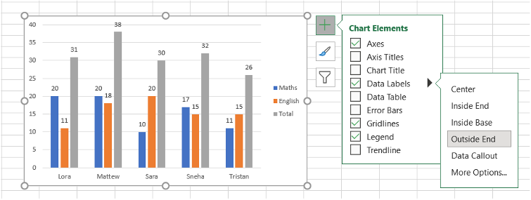
1. Chart Elements (Plus Sign Icon)
This tool allows you to add, remove, or modify various chart elements such as titles, labels, gridlines, and more.
- Click on the plus sign icon to open the Chart Elements menu.
- Check or uncheck the boxes to add or remove elements from your chart.
- Use the arrows next to each element to access more options, such as positioning or formatting specific elements
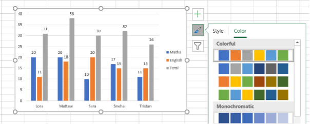
2. Chart Styles (Paintbrush Icon)
This tool provides a quick way to change the visual style of your chart, including colors and overall design.
- Click on the paintbrush icon to open the Chart Styles menu.
- Browse through the available styles and select one to apply it to your chart.
- Switch between the “Style” and “Color” tabs to adjust the chart’s overall design or color scheme separately.
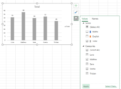
3. Chart Filters (Filter Icon)
This tool allows you to filter the data displayed in your chart, helping you focus on specific data points or series.
- Click on the filter icon to open the Chart Filters menu.
- Use the checkboxes to select or deselect data series or categories you want to include or exclude from the chart.
- Click “Apply” to update the chart based on your selections.
***
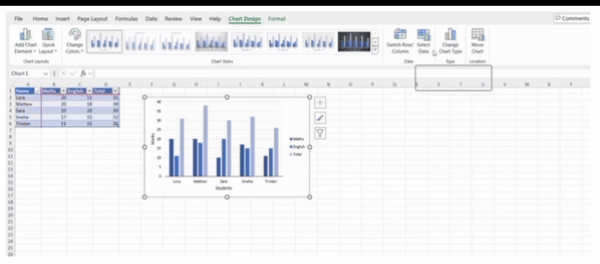
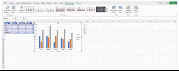
Formatting Charts in Excel
Select the Chart: click on the chart to select it. This will automatically bring up the Chart Design and Format tabs on the ribbon.
Functions in the Chart Design Tab
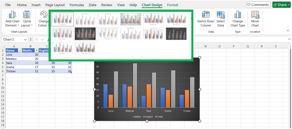
1. Chart Layouts Group
- Add Chart Element: Allows you to add or modify chart elements
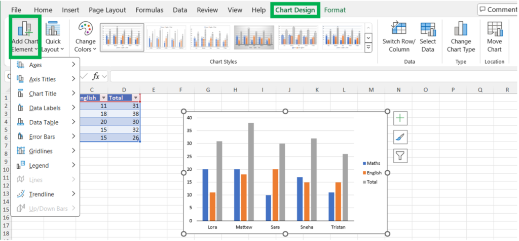
Chart elements are:
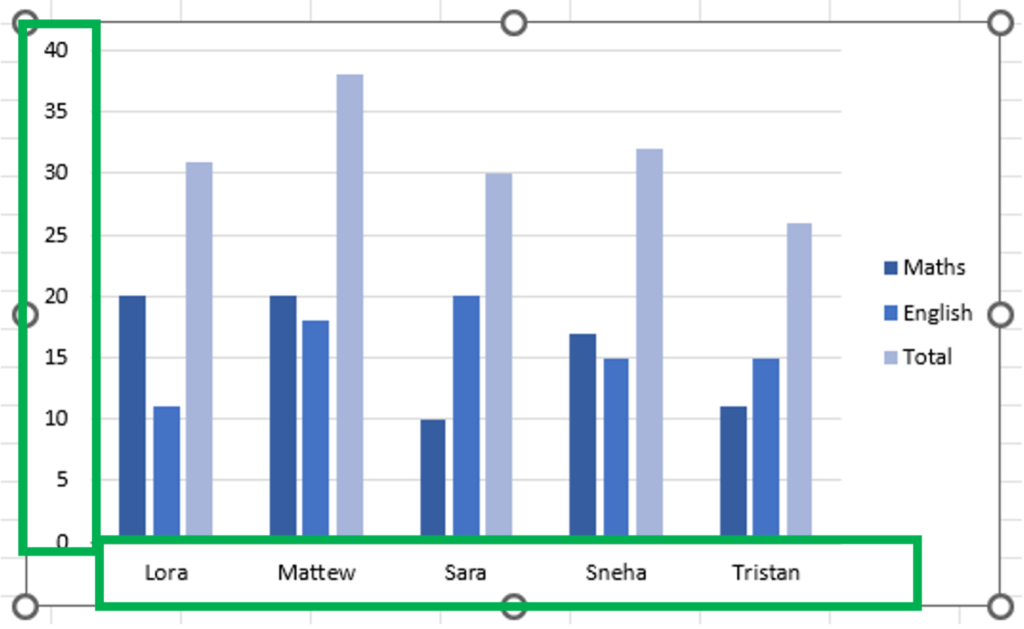
1. Axes: Allows you to add or modify the horizontal and vertical axes of the chart.
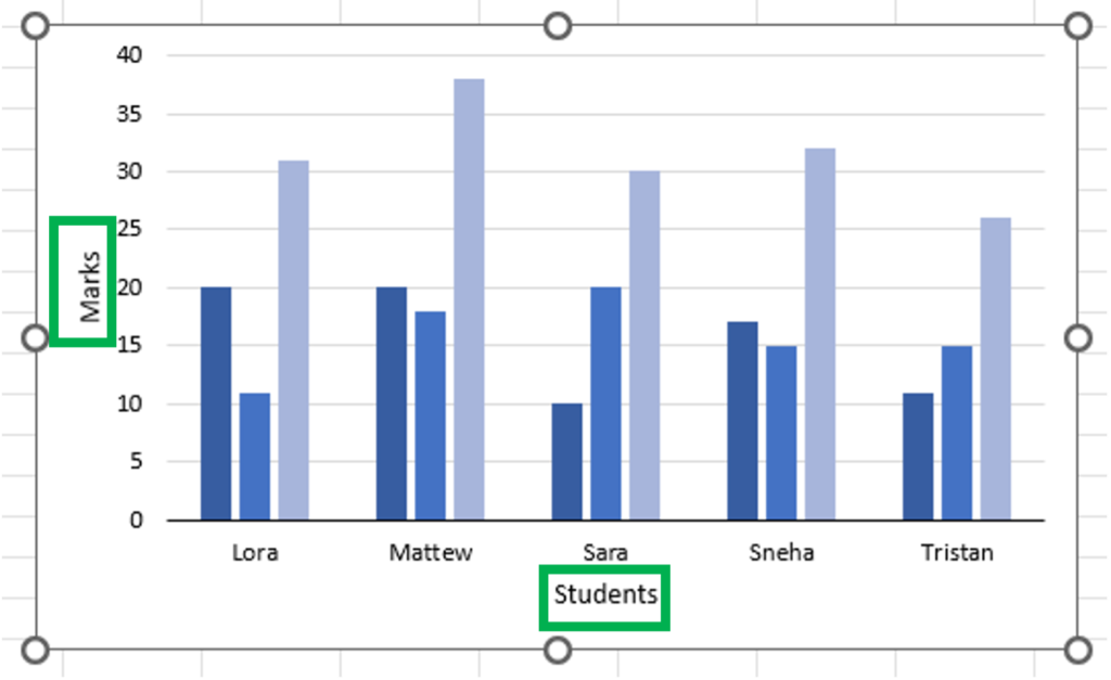
2. Axis Titles: Allows you to add or edit titles for the horizontal and vertical axes.
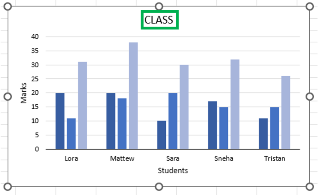
3. Chart Title: Let you add or edit the main title of the chart.
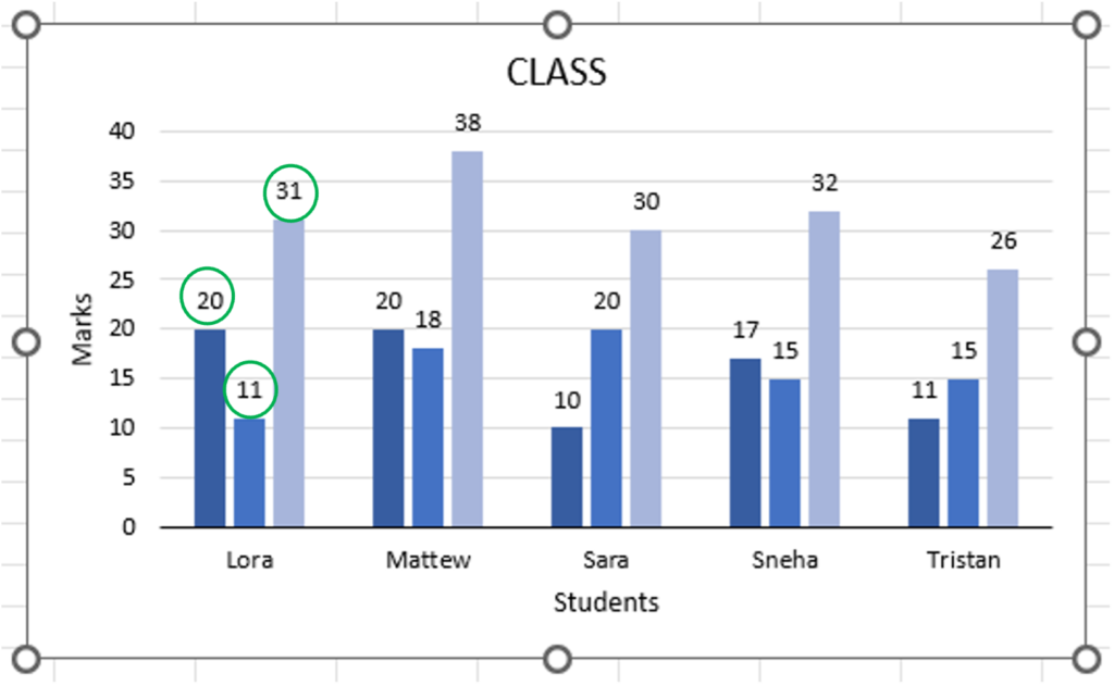
4. Data Labels: Add labels to your data points, showing the exact values of the data.
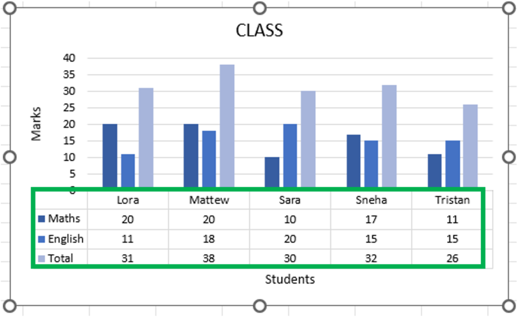
5. Data Table: Displays a data table at the bottom of the chart, showing the values in a table format.
6. Error Bars: Add error bars to your chart to show variability in data.
7. Gridlines: Adds or modifies gridlines in the chart for better readability. You can add primary major, primary minor, secondary major, and secondary minor gridlines.
8. Legend: Adds or modifies the chart legend, which helps identify the data series.
8. Lines: Adds lines such as drop lines, high-low lines, and up/down bars to your chart to enhance its visual representation.
9. Trendline: Adds a trendline to your chart, which shows the general direction of the data.
10. Up/Down Bars: Adds bars that highlight the difference between two data series.
**
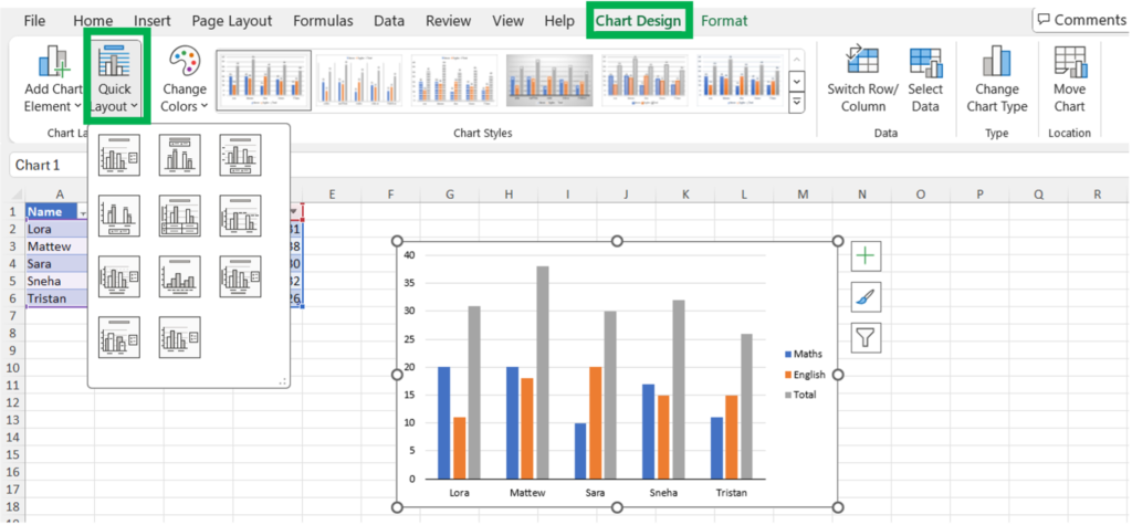
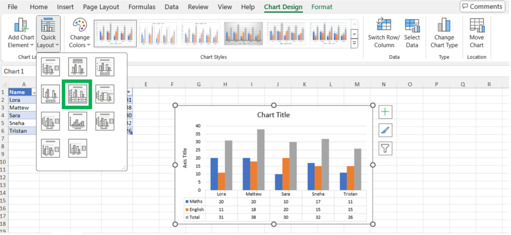
2. Quick Layout: Offers predefined chart layouts that combine various chart elements in a specific configuration.
***
2. Chart Styles Group
Change Colors: Provides a palette of color schemes to apply to your chart.
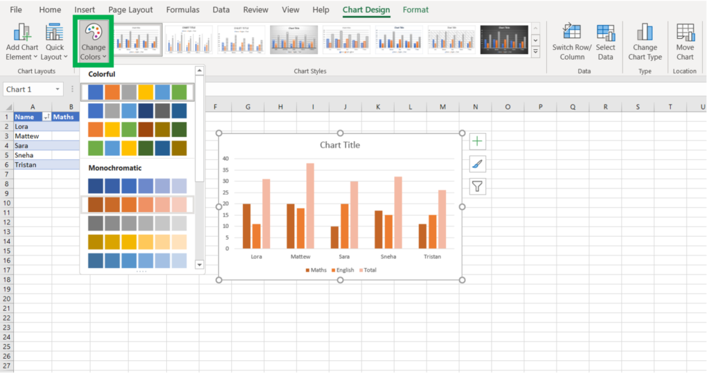
Chart Styles: Offers a gallery of predefined chart styles that you can apply to your chart to quickly change its appearance.
***
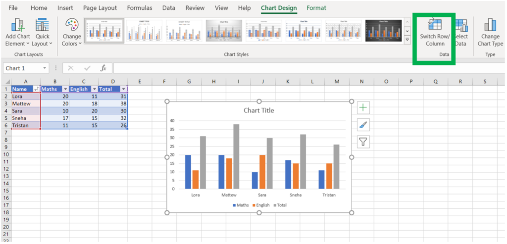
3. Data Group
Select Data: Opens the Select Data Source dialog box, allowing you to modify the data range and series used in the chart.
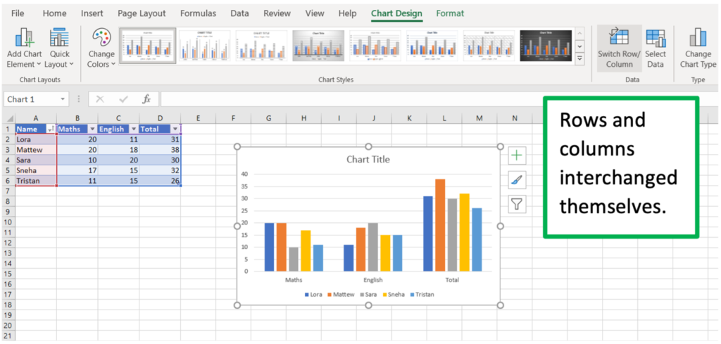
Switch Row/Column: Toggles the chart’s data orientation, swapping the row and column data.
***
4. Type Group
Change Chart Type: Opens the Change Chart Type dialog box, allowing you to switch to a different type of chart (e.g., from a Column chart to a Line chart).
***
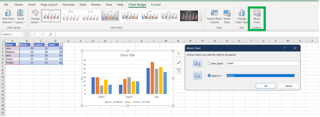
5. Location Group
Move Chart: Opens the Move Chart dialog box, allowing you to move the chart to a new sheet or to an existing sheet within the workbook.
***
Additional Chart Tools in Excel
While the above groups cover the primary functions within the Chart Design tab, you can also customize your chart using the Format tab that appears alongside the Chart Design tab.
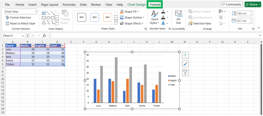
The Format tab allows you to:
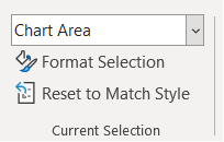
Format Selection: Apply specific formatting to selected chart elements.
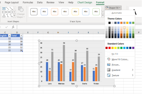
Shape Styles: Do a color fill to the chart area.
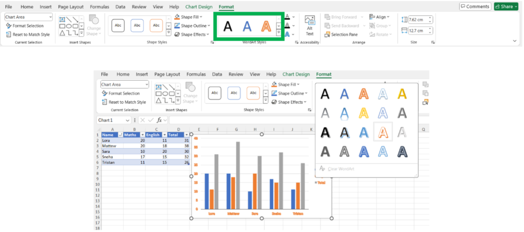
WordArt Styles: Apply text effects to chart titles and labels.
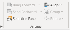
Arrange: Adjust the layering and alignment of chart elements.
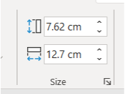
Size: Change the size of the chart or specific chart elements.
Conclusion
By following these guidelines, you can create professional and informative charts that effectively convey your data to insights. Whether for personal use, academic projects, or professional reports, mastering Excel charts will enhance your ability to present data in a compelling and informative manner.