
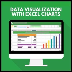
What are Excel Charts?
An Excel chart is a graphical representation of data. It helps provides an opportunity to tell a compelling story to the audience through data visualization.
Data visualization helps to understand the data patterns and connections. It is important to focus on the information that matters and tell a story derived from the data.
According to Cambridge dictionary[1], a chart is a drawing that shows information in a simple way, often using lines and curves to show amounts.
Quite often we spend a lot of time on data analysis. Being able to choose the right type of chart to give a correct representation of data is equally important as doing the right analysis. If the chart type is not correct, it becomes difficult to say a convincing story.
In this article, we will discuss the different types of charts and type of data they are suitable for.
Bar Charts
A bar chart is the most commonly used chart type. As the name suggest, it is composed of a series of bars illustrating a variables development. It is easy to read and understand. A Bar chart is frequently used to compare data across time frames (like revenue/ profit increase from one time to another).
These charts are great to use when we want them to track the development of one or two variables. For example, if we want to compare the revenues vs previous year.

Limitation of Bar chart is that we cannot use it to compare more than 1 or 2 variables. If we have multiple variables on the Bar chart, it is difficult to understand the trend of the variables.
Do you know 10 most used Financial Functions in Excel
Stacked Column Chart
A stacked column chart is most commonly used to compare data over time. In this chart, the data series is stacked on top of each other in vertical columns. Such charts are also easy to create and understand.
An example for usage of this chart is for comparing revenue contribution by segments.
The limitation of this chart is that it may appear complex and difficult to read if there are more than 4 or 5 segments or if the data series is too long.
To get over such limitation, we can also show data with 100% stacked column chart (as shown below).
Know more about 80 PowerPoint Shortcut Keys
Line Chart
A line chart is a chart showing a line or multiple lines showing development of single or multiple variables over time. It allows us to track development of several variables over time in a single chart. Such charts are easy to read and understand.
Such charts are most used while comparing share price movements for multiple companies, indices etc. over both short term and long term. See Example of a line chart showing share price movement of top three Private Banks in India.
Line charts are also used by analysts to understand the correlation between two or more different variables. Like movement in Oil Prices with Oil Rig deployment or comparing base metal prices with consumption/demand etc.
Such charts are useful to analyze data for a time series. It cannot be used if we do not have data for a time series/period.
Combination Chart
Combination charts is created by combining different type of charts. Like a Combo Bar chart and a line chart . Such charts are useful when we want to analyze data trend over a time.
For example, comparing the revenue growth with margins. Such charts are useful when we want to compare data across multiple variables.
Pie Chart
A Pie chart is a circular chart showing slices (breakup) of data by proportions. The entire pie chart represents 100% of data while the slices represent proportions of data. Sum of all slices should be equal to the Total Pie (100%).
For example, if we want to see revenue contribution by different segments of a company, we can use a Pie chart. A larger Pie size for a segment means, the larger share of revenue contribution by that segment.
The limitation of using a Pie chart is that it can only be used for one single variable . We cannot use the pie chart when we have more than one variable or if we want to see change in variable from one period to the other.
Learn 100+ Useful Excel Short Cuts
Scatter Plot
These charts are often used in field of statistics and data science. It consists of data points depicted across two variables (x-y axis).
A scatter plot chart is used when we want to see the pattern/ correlation between two variables. For example, if we want to see a correlation between Customer satisfaction index and Total revenues, we can show the correlation through a scatter plot chart.
Relationships between variables could differ by situations. For Example, it could have positive or negative correlation or have linear or non-linear correlation.
A scatter plot chart cannot be used when we don’t have 2 or more variables or when want to see the time pattern.
Waterfall Charts
A waterfall chart is a great way to show variance analysis from one point to the other. These charts help easily visualize the drivers which are responsible for the change. For Example. how the profit or revenue of a company grew from one period to the other.
We can’t use the waterfall chart for data that does not explain the drivers for change from one period to another. Therefore, if we do not have the intermediary steps or variables leading to change in performance from one period to another, we cannot use the waterfall chart.
Learn to use charts in business presentation and make it effective.
Tree Map Charts
A Tree map chart is not often used but is an effective chart for data visualization. It is a hierarchical chart. It is useful for visualization of data which has multiple level of segmentation. It gives a pictorial representation of how data is spread across various segments/ sub-segments. In a Tree Map, each segment is represented by a large rectangle and segments of data are represented by smaller rectangles. Tree map charts are great highlighting the contribution of each items to the whole.
A Tree Map chart cannot be used if the data set is not hierarchical meaning when data cannot be divided into segments and sub segments. It also cannot be used if we want to see the time pattern for multiple variables in a data set.
Bubble Chart
A Bubble chart is an extension of a scatter plot chart, where in addition to a scatter plot (2 dimensions represented by the x axis and y axis), the size of the bubble represents the 3rd variable.
It is often used effectively to show the performance comparison across different segments of a company or across different peers.
In the above chart, shows the performance comparison across different companies in an industry. The x-axis shows the revenue growth, the y-axis shows the margin and the size of the bubbles represent the revenues for different Companies.
A bubble chart also cannot be used when we don’t have 2 or more variables or when want to see the time pattern.
Histogram Chart
A Histogram chart is similar to a Bar Chart and is used when we want to show the frequency distribution of data. For this chart, we can group data into different bins, and we can easily summarize where the data concentration is.
This chart is very effective when we want to show the distribution of data within a range. For example, Data showing average Weight of population between in a society.
A Histogram Chart cannot be used, If the data set has multiple categories of variables.
Conclusion
While data analysis is important, the correct presentation of data is equally important. Therefore, It is necessary to choose the right type of chart for data visualization, so that we are able to say a compelling story to the audience.
To improve your data analysis and visualization skills, please visit our online course Data Analyst Skills Training in Excel. This program will help you Go from beginner to an Expert in Data Analytics and Visualization skills in Excel? Join this program to create reports quickly through hands-on projects.
Keep Learning.


55 thoughts on “Data Visualization with Excel Charts: A Comprehensive Guide”
[…] charts are a type of data visualization tool that display changes in a value over time. They are particularly useful for showing the impact […]
[…] To learn more about how to use these different types of charts, check out our comprehensive guide on making charts with Excel. […]
… [Trackback]
[…] Find More on on that Topic: skillfine.com/excel-charts-for-data-visualization/ […]
… [Trackback]
[…] Info to that Topic: skillfine.com/excel-charts-for-data-visualization/ […]
… [Trackback]
[…] Information on that Topic: skillfine.com/excel-charts-for-data-visualization/ […]
… [Trackback]
[…] Information on that Topic: skillfine.com/excel-charts-for-data-visualization/ […]
… [Trackback]
[…] Information to that Topic: skillfine.com/excel-charts-for-data-visualization/ […]
… [Trackback]
[…] Read More on on that Topic: skillfine.com/excel-charts-for-data-visualization/ […]
… [Trackback]
[…] Find More on to that Topic: skillfine.com/excel-charts-for-data-visualization/ […]
… [Trackback]
[…] Read More here to that Topic: skillfine.com/excel-charts-for-data-visualization/ […]
… [Trackback]
[…] Find More on to that Topic: skillfine.com/excel-charts-for-data-visualization/ […]
… [Trackback]
[…] Read More Information here to that Topic: skillfine.com/excel-charts-for-data-visualization/ […]
… [Trackback]
[…] Info to that Topic: skillfine.com/excel-charts-for-data-visualization/ […]
… [Trackback]
[…] Find More on that Topic: skillfine.com/excel-charts-for-data-visualization/ […]
… [Trackback]
[…] Read More Info here on that Topic: skillfine.com/excel-charts-for-data-visualization/ […]
… [Trackback]
[…] Read More on that Topic: skillfine.com/excel-charts-for-data-visualization/ […]
… [Trackback]
[…] Find More Info here on that Topic: skillfine.com/excel-charts-for-data-visualization/ […]
… [Trackback]
[…] Find More Information here to that Topic: skillfine.com/excel-charts-for-data-visualization/ […]
… [Trackback]
[…] Find More on that Topic: skillfine.com/excel-charts-for-data-visualization/ […]
… [Trackback]
[…] Read More Info here on that Topic: skillfine.com/excel-charts-for-data-visualization/ […]
… [Trackback]
[…] Find More on to that Topic: skillfine.com/excel-charts-for-data-visualization/ […]
Say, you got a nice post.Much thanks again. Keep writing.
I am so grateful for your article post.Really thank you! Really Great.
Your writing is both informative and engaging. This post was a fantastic read!
What’s Going down i’m new to this, I stumbled upon thisI have discovered It positively helpful and it has aided me out loads.I’m hoping to contribute & help other customers like its helped me.Good job.
Hi there, I found your site via Google while searching for a related topic, your site came up, it looks great. I have bookmarked it in my google bookmarks.
I believe what you posted was very logical. But, what about this?
suppose you were to create a killer post title?
I am not saying your information is not solid., but suppose
you added a title that makes people want more? I mean Data Visualization with
Excel Charts: A Comprehensive Guide – skillfine is kinda vanilla.
You ought to look at Yahoo’s home page and note how they create post titles to grab people
interested. You might add a related video or
a related pic or two to get readers excited about everything’ve got to say.
Just my opinion, it would make your website a little bit more interesting.
I have read so many content concerning the blogger lovers except this paragraph is genuinely
a fastidious post, keep it up.
I for all time emailed this webpage post
page to all my associates, for the reason that if like to read it
then my friends will too.
Piece of writing writing is also a excitement, if you know then you can write if not it is difficult to write.
Your point of view caught my eye and was very interesting. Thanks. I have a question for you.
Try your luck at BitStarz, get up to $500 or 5 BTC + 180 Free Spins, including live dealer and table games. Access via working mirror site.
Spribe Aviator game review and app features
Detailed aviator game review for Indian players
Casino mirror supports responsible gambling settings
Играй в Лаки Джет — игра, где всё решает время и интуиция!
Apply mikrokredit now — instant approval
Get fast access to casino slots via a mirror
Your point of view caught my eye and was very interesting. Thanks. I have a question for you.
Always keep an updated casino mirror to access live dealer games.
Try now: Lucky Jet – it’s everywhere!
Mit LeonBet kannst du �berall und jederzeit spielen.
I don’t think the title of your article matches the content lol. Just kidding, mainly because I had some doubts after reading the article.
734202 293833It is onerous to search out knowledgeable individuals on this topic, nonetheless you sound like you already know what you are talking about! Thanks 196479
Decently, I’m obsessed with these CBD gummies like [url=https://www.cornbreadhemp.com/blogs/learn/do-thc-gummies-expire-and-if-so-can-i-still-eat-them ]do thc gummies expire[/url]! I’ve tried a collection of brands, but these are legit the best. I pop song after a long daytime and it objective helps me sneezles abroad and be over overthinking everything.
They leaning like actual candy no odd grassy flavor at all. My drop has been fail elevate surpass since I started enchanting them, too. If you’re on the fence, objective get them! They’re a total lifesaver as a remedy for my routine stress.
CBD products experience in good faith changed my subsistence! I not under any condition expected something so unpremeditated [url=https://cobocbd.com/collections/cbd-topicals ]cbd cooling cream[/url] to carry such tranquil and accord into my every day routine. Significance that in olden days felt uncontrollable is second so much easier to control, and my sleep has develop deeper and more refreshing. Yet muscle aches after protracted days fade faster. It feels extraordinary to once have something light to this day dynamic that supports both main part and mind. I can’t take it as given my days without CBD anymore!
I’ve been using [url=https://www.nothingbuthemp.net/collections/magic-mushrooms ]legal magic mushroom gummies[/url] regular for over a month nowadays, and I’m truly impressed by the uncontested effects. They’ve helped me determine calmer, more balanced, and less anxious throughout the day. My snore is deeper, I wake up refreshed, and sober my nave has improved. The attribute is famous, and I cognizant the common ingredients. I’ll obviously preserve buying and recommending them to the whole world I recall!
I’ve been using [url=https://www.nothingbuthemp.net/collections/thca-flower ]best thca flower[/url] ordinary seeing that during the course of a month now, and I’m truly impressed before the positive effects. They’ve helped me judge calmer, more balanced, and less tense from the beginning to the end of the day. My saw wood is deeper, I wake up refreshed, and sober my core has improved. The trait is famous, and I cognizant the sensible ingredients. I’ll categorically carry on buying and recommending them to person I know!
I’ve been using thc edibles constantly seeing that on the other side of a month for the time being, and I’m indeed impressed at near the sure effects. They’ve helped me feel calmer, more balanced, and less restless in every nook the day. My snore is deeper, I wake up refreshed, and even my nave has improved. The trait is famous, and I cherish the common ingredients. I’ll positively heed buying and recommending them to the whole world I recall!
I’ve been exploring terpene botanicals – [url=https://terpenewarehouse.com/collections/cannabis-terpenes-diamond ]marijuana terpenes for sale[/url] recently, and I’m really enjoying the experience. The scents are with, typical, and pleasant. They annex a nice drink to my day after day habit, dollop fasten on the willing and atmosphere. A brobdingnagian find quest of anyone who appreciates perfumed wellness tools.
I’ve been exploring terpene botanicals – https//terpenewarehouse.com/products/berry-gelato-terpenes recently, and I’m indeed enjoying the experience. The scents are rich, real, and pleasant. They enlarge a nice caress to my day after day routine, ration beat up a compare the feeling ready and atmosphere. A large find after anyone who appreciates aromatic wellness tools.
I’ve been exploring terpene botanicals recently, and I’m deep down enjoying the experience. The scents are with, real, and pleasant. They add a outgoing touch to my constantly drill, helping congeal the willing and atmosphere. A large track down to save anyone who appreciates aromatic wellness tools.
The CBD store – [url=https://www.tillmanstranquils.com/products/cbd-gummies-for-energy ]cbd thc gummies for energy[/url] offers a multifariousness of formats that please exceptional preferences, and each undivided feels grandly executed. The oil appears clean and consistent, the packaging materials bear heavy-duty, and the design is lucid yet elegant. The products are quiet to stock and travel with, thanks to sheltered lids and thick sizing. Entire, the brand delivers a outstanding and carefully crafted test without unnecessary extras.
861098 724361Hi there, just became aware of your blog through Google, and found that it is truly informative. Ill be grateful in case you continue this in future. Lots of folks will benefit from your writing. Cheers! 345294
809768 623129Id need to speak to you here. Which is not some thing Which i do! I like reading an article that can make folks believe. Also, thank you for permitting me to comment! 576235