
As we delve deeper into the world of data analysis, it’s important to know how to present and visualize data effectively. Excel is one of the most widely used tools for data visualization, but many users struggle with creating customized excel charts that accurately represent their data. That’s where this guide comes in – we’ll teach you how to create charts in Excel that are not only visually appealing but also accurately convey your data.
From choosing the right chart type to formatting charts in Excel for maximum impact, we’ll cover all the essential tips and tricks you need to know. Whether you’re a data analyst, a marketer, or just someone who wants to make their data more understandable, this guide will be an invaluable resource for creating effective visualizations. So let’s get started and learn how to make Excel charts easy and accessible!
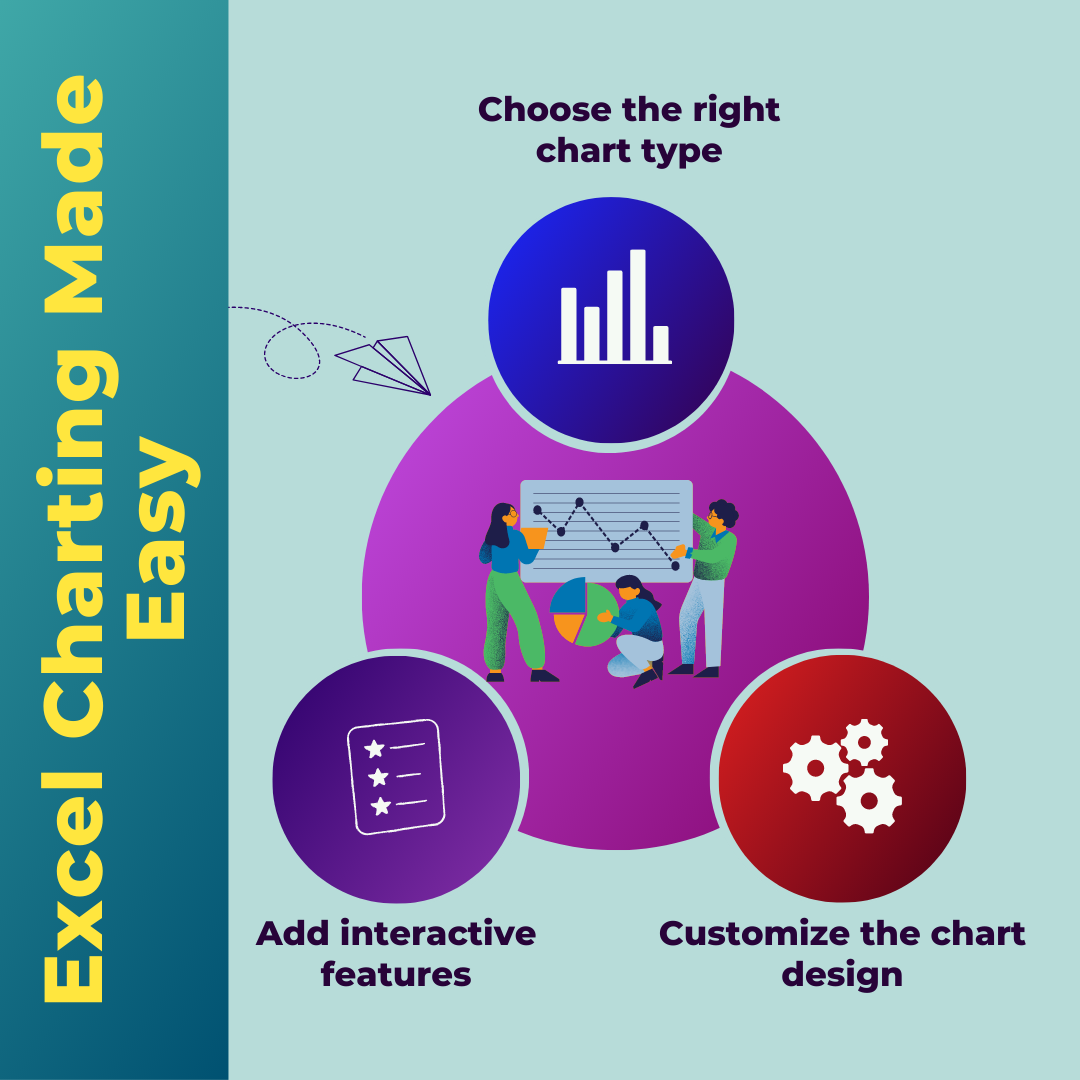
Types of charts and when to use them
One of the most important decisions you’ll make when creating a chart in Excel is choosing the right chart type. Excel offers a wide range of chart types, each with its own strengths and weaknesses.
For example, a pie chart is great for showing how a single variable is divided into different categories. It’s easy to read, and the slices can be color-coded for better differentiation. However, if you’re comparing multiple variables, a bar chart or a column chart may be more appropriate. These charts allow you to compare data side by side, making it easier to see trends and patterns.
Another common chart type is the line chart, which is great for showing changes over time. If you’re tracking data over a period of months or years, a line chart can help you see how the data has changed and identify any trends or patterns.
When choosing a chart type, it’s important to think about what story you want to tell with your data. What do you want your audience to take away from the chart? By choosing the right chart type, you can ensure that your data is presented in a way that is easy to understand and visually appealing.
Formatting data for charting
Before you can create a chart in Excel, you’ll need to make sure your data is properly formatted. This means organizing your data into columns and rows and ensuring that each column has a clear header.
When formatting your data, it’s also important to consider the scale of your data. Are you comparing data that is measured in different units? If so, you may need to adjust the scale of your chart to ensure that the data is accurately represented.
For example, if you’re comparing sales data for two different products, one of which is significantly more expensive than the other, you may need to adjust the scale of your chart to ensure that the differences are clearly visible.
In addition to formatting your data, it’s also important to ensure that your data is accurate and up to date. This means double-checking your calculations and verifying that your data is complete. If your data is incomplete or inaccurate, your chart may not accurately represent the information you’re trying to convey.
Creating basic charts in Excel
Creating a basic chart in Excel is relatively simple. Once you’ve formatted your data, select the cells you want to include in your chart and click on the “Insert” tab in the Excel ribbon.
From there, you can select the type of chart you want to create and customize it to fit your needs. Excel offers a range of customization options, including changing the color scheme, adding data labels, and adjusting the font size and style.
When creating a basic chart, it’s important to keep in mind the principles of effective data visualization in excel. This means making sure that your chart is easy to read and that the data is accurately represented.
For example, if you’re creating a bar chart, you may want to ensure that the bars are all the same width and that the axis labels are clearly labeled. If you’re creating a line chart, you may want to adjust the scale of your chart to ensure that the data is accurately represented.
Customizing charts for effective data visualization
While basic charts can be useful for presenting simple data sets, they may not be sufficient for more complex data analysis. That’s where customization comes in – by customizing your charts, you can create visualizations that accurately represent your data and effectively communicate your message.
One of the most important customization options in Excel is the ability to add chart elements. This includes things like data labels, trend lines, and error bars. By adding these elements to your chart, you can provide additional information that helps your audience understand the data more clearly.
Another important customization option is the ability to change the chart type. If you’re finding that a particular chart type isn’t effectively conveying your data, you may want to experiment with different chart types to find the one that works best for your needs.
When customizing your charts, it’s important to keep in mind the principles of effective data visualization. This means making sure that your chart is easy to read and that the data is accurately represented.
Advanced charting techniques in Excel
For more advanced data analysis, Excel offers a range of advanced charting techniques. These include things like sparklines, heat maps, and bubble charts.
Sparklines are small, inline charts that can be added to a cell in a spreadsheet. They’re useful for showing trends over time or comparing data across different categories.
Heat maps are another advanced charting technique that can be useful for visualizing large data sets. They use color-coding to show how data varies across different categories, making it easier to identify patterns and trends.
Bubble charts are another useful tool for visualizing data. They use circles of different sizes to represent data points, with the size of the circle indicating the value of a particular variable.
When using advanced charting techniques, it’s important to keep in mind the principles of effective data visualization. This means making sure that your chart is easy to read and that the data is accurately represented.
Common mistakes to avoid when charting in Excel
While Excel is a powerful tool for data visualization, there are also some common mistakes that users should avoid. One of the most common mistakes is using the wrong chart type.
For example, if you’re trying to compare data across different categories, a pie chart may not be the best choice. Similarly, if you’re trying to show changes over time, a bar chart or a line chart may be more appropriate than a scatter chart.
Another common mistake is failing to properly label your chart. This means ensuring that the axis labels are clearly labeled and that the chart title accurately reflects the data being presented.
Finally, it’s important to avoid cluttering your chart with too much information. This can make it difficult for your audience to understand the data and identify trends or patterns.
Tips for creating visually appealing charts
In addition to accurately representing your data, it’s also important to create charts that are visually appealing. This means paying attention to things like color scheme, font size, and chart layout.
When choosing a color scheme, it’s important to choose colors that are easy on the eyes and that provide good contrast. Avoid using too many bright colors or using colors that are too similar, as this can make it difficult for your audience to differentiate between data points.
Similarly, when choosing a font size, it’s important to choose a size that is large enough to be easily read but not so large that it overwhelms the chart.
Finally, when laying out your chart, it’s important to ensure that the data is easy to read and that the chart isn’t cluttered with too many elements. This means using white space effectively and making sure that the chart is balanced and visually appealing.
Benefits of customized charts for data visualization
By creating customized charts in Excel, you can effectively communicate your message and make your data more understandable. Customized charts allow you to highlight important trends and patterns, provide additional context for your data, and make it easier for your audience to understand the information you’re presenting.
In addition, customized charts can help you make more informed decisions based on your data. By visualizing your data in different ways, you may be able to identify trends or patterns that you wouldn’t have noticed otherwise.
Conclusion and next steps
Excel charting can be a powerful tool for data visualization, but it requires careful planning and attention to detail. By choosing the right chart type, formatting your data correctly, and customizing your charts for maximum impact, you can create visualizations that effectively communicate your message and make your data more understandable.
If you’re new to Excel charting, start by experimenting with basic charts and gradually work your way up to more advanced charting techniques. And remember, always keep the principles of effective data visualization in mind – accuracy, clarity, and simplicity. With these tips and tricks, you’ll be well on your way to becoming an Excel charting expert!


43 thoughts on “Excel Charting Made Easy: How to Create Customized Charts for Effective Data Visualization”
[…] Excel charts with colored areas help people focus. Arrows give us scale. Assume your audience doesn’t understand what you’re saying, even if they do. Nobody wants to open a recipe book to learn how to cook soup. Instead, we start with a recipe. […]
MyCellSpy est une application puissante pour la surveillance à distance en temps réel des téléphones Android.
Cela peut être ennuyeux lorsque vos relations sont perturbées et que son téléphone ne peut pas être suivi. Maintenant, vous pouvez facilement effectuer cette activité à l’aide d’une application d’espionnage. Ces applications de surveillance sont très efficaces et fiables et peuvent déterminer si votre femme vous trompe.
Suivre le téléphone portable – Application de suivi cachée qui enregistre l’emplacement, les SMS, l’audio des appels, WhatsApp, Facebook, photo, caméra, activité Internet. Idéal pour le contrôle parental et la surveillance des employés. Suivre le Téléphone Gratuitement – Logiciel de Surveillance en Ligne.
Helpful info. Lucky me I discovered your web site unintentionally, and I’m stunned why this accident didn’t happened earlier! I bookmarked it.
444488 575598Some genuinely nice stuff on this internet site , I enjoy it. 566061
349875 913629Glad to be 1 of several visitants on this amazing internet web site : D. 313245
Mantap sekali untuk artikelnya, benar-benar membantu.
Saya baru tahu hal ini dan kemarin juga menemukan **jambinow.com**
yang menyediakan artikel berita dengan penyajian praktis.
Harapan saya blog ini semakin maju.
Makasih untuk postingannya, benar-benar membantu.
Saya semakin mengerti hal ini dan saat itu
juga membaca **takuhaifoods.com**
yang membagikan tulisan seputar food dengan penyajian praktis.
Mudah-mudahan admin selalu sukses.
Terima kasih untuk postingannya, isinya inspiratif.
Saya semakin mengerti hal ini dan saat itu juga menemukan **steposhoes.com**
yang menyediakan tulisan seputar shoes dengan gaya mudah
dipahami.
Mudah-mudahan admin selalu sukses.
Website GTA138 merupakan ruang digital untuk menemukan ulasan aktual.
Di sini pengunjung bisa menjelajahi konten menarik mengenai tren online.
Dengan bahasa lugas, GTA138 berkomitmen menjadi referensi bagi pembaca.
Menarik sekali tulisan yang dibagikan, menambah wawasan baru.
Saya suka membacanya dan beberapa waktu lalu juga menemukan **zaacaiatl.com**
yang menyediakan konten digital dengan gaya praktis.
Harapan saya selalu maju.
Postingan ini benar-benar bermanfaat,
memberikan perspektif berbeda.
Saya senang sekali membacanya dan belakangan juga menjelajahi **GTA138**
yang menawarkan informasi online dengan bahasa sederhana.
Harapan saya terus maju.
Saya sudah coba main di MPO102 dan hasilnya memuaskan.
Transaksi MPO102 gampang dan praktis.
Peluang jackpot di sini besar.
Saya rekomendasikan MPO102.
904665 454935certainly like your internet internet site but you need to have to check the spelling on several of your posts. Several of them are rife with spelling troubles and I find it really troublesome to tell the truth nevertheless I will undoubtedly come back again. 248041
Terima kasih atas artikel yang menarik ini. Saya pribadi sudah mencoba GTA777 dan menurut saya sangat mudah digunakan. Daftarnya nggak ribet, fiturnya
cukup lengkap, dan promonya selalu ada.
Yang saya suka, GTA777 juga memiliki keamanan bagus, jadi saya merasa lebih aman saat menggunakannya.
Layanan pelanggannya juga responnya cepat, sehingga kalau ada masalah bisa langsung terbantu.
Menurut saya, GTA777 bisa direkomendasikan untuk
siapa pun yang mencari hiburan online dengan fitur praktis dan keamanan terjamin.
Makasih untuk artikelnya, sangat bermanfaat.
Saya semakin mengerti hal ini dan kebetulan juga berkunjung
ke **theprettyjerk.com**
yang menyajikan konten lifestyle dengan penyajian praktis.
Harapan saya blog ini semakin maju.
Terima kasih untuk tulisannya, sangat bermanfaat.
Saya baru tahu hal ini dan kemarin juga membaca **serialflasher.com**
yang menyediakan informasi software dengan penyajian praktis.
Mudah-mudahan blog ini semakin maju.
Makasih untuk tulisannya, benar-benar membantu.
Saya jadi paham hal ini dan saat itu juga berkunjung ke
**sutidoliterasi.com**
yang membagikan konten literasi dengan gaya mudah dipahami.
Semoga blog ini semakin maju.
Mantap sekali untuk postingannya, sangat bermanfaat.
Saya semakin mengerti hal ini dan kemarin juga berkunjung ke **takuhaifoods.com**
yang membagikan artikel kuliner dengan penyajian praktis.
Semoga kontennya makin berkembang.
Mantap sekali untuk postingannya, sangat bermanfaat.
Saya baru tahu hal ini dan saat itu juga membaca **tapchinhathuoc.com**
yang menyediakan tulisan inspiratif dengan penyajian praktis.
Semoga blog ini semakin maju.
Luar biasa tulisan yang disajikan, sangat inspiratif.
Saya tertarik membacanya dan kemarin juga membaca **siyuanbma.com**
yang menyediakan konten bisnis dengan gaya mudah dipahami.
Mudah-mudahan makin berkembang.
Suka sekali dengan konten yang dibagikan, sangat membuka wawasan.
Saya mendapatkan ide segar dan kemarin juga berkunjung ke **mocomedecor.com**
yang menyediakan tips desain kreatif dengan gaya sederhana.
Harapan saya selalu maju.
Wedding Venues in Delhi is here to help you find and book the perfect place for your special day. We offer a range of wedding services to make your wedding planning easy and stress-free. We can also customize your wedding according to your budget and preferences.
673239 831090But wanna admit that this is really useful , Thanks for taking your time to write this. 541933
Wedding Venues In GT Karnal Road. Wedding Venues GT Karnal Road Book Farmhouses, Banquet Halls, Hotels for Party places at GT Karnal Road Ever thought of enjoying a multi-theme Wedding Function while being at just one destination? If not then you must not have visited Farmhouses.
56079 446299i was just browsing along and came upon your website. just wantd to say excellent job and this post actually helped me. 41269
745831 339805I totally agree! I came over from google and am looking to subscribe. Exactly where is your RSS feed? 248396
Nhiều slot tại slot365 có cơ chế jackpot lũy tiến liên kết giữa các nền tảng – giải thưởng có thể lên tới hàng tỷ đồng và được cập nhật theo thời gian thực ngay trên màn hình. TONY03-11O
Всем привет!
Столкнулся на днях с неприятностью, как правильно устранить мелкие царапины на кузове. Особенно это актуально, когда планируешь продажу авто.
Главная сложность здесь — это найти нужный код краски. Если просто закрасить «маркером» из масс-маркета, результат может только испортить вид.
Для тех, кто ищет профессиональный подход, рекомендую отличный ресурс:
[url=https://gorod.kr.ua/forum/showthread.php?p=317056 ]как избавиться от царапин на лакокрасочном покрытии [/url]
Там собрана база по автокорректор от царапин какой лучше , которая поможет сделать ремонт незаметным.
Надеюсь, информация будет полезной!
Всегда откликнусь к вашему запросу о помощи по вопросам Замена бампера переднего на фольксваген поло цена – стучите в Телеграм sod85
[url=https://remstroytlt.ru ]дом клееный брус
[/url]
Trbet – Trbet GiriЕџ – Trbet Adresi. Trbet bahis sitesi hakkД±nda gГјncel geliЕџmeler ile birlikte Trbet giriЕџ duyurularД±nД±n yanД± sД±ra gГјncel adres giriЕџine sayfamД±zdan eriЕџebilirsiniz. Kolay Trbet GiriЕџi. Trbet HakkД±nda HerЕџey. Trbet GГјncel GiriЕџ Adresi 2026. 4 Ocak 2026. 4 Ocak 2026. Trbet. Kategori: Trbet Adres DuyurularД±. Trbet bahis sitesinin adres deДџiЕџtirmesi, kullanД±cД±larД±n son yД±llarda sД±kГ§a karЕџД±laЕџtД±ДџД± ama Г§oДџu zaman tam olarak nedenini bilmediДџi bir durumdur. AslД±nda bu sГјrecin arkasД±nda karmaЕџД±k bir neden yoktur. Trbet gГјncel giriЕџ adresi 2026 yД±lД± iГ§inde deДџiЕџecek, çünkГј hizmet verdiДџi bahisГ§ilerin siteye sorunsuz Еџekilde eriЕџmesini istiyor. Mevcut adres eriЕџime kapandД±ДџД±nda en pratik ve hД±zlД± çözГјm olarak yeni… Trbet Benzeri Sahte Sitelere Dikkat. 22 AralД±k 2025. Trbet. Kategori: Trbet GeliЕџmeleri. Trbet tarafД±ndan yapД±lan uyarД± niteliДџindeki duyuru ile sahte sitelere dikkat Г§ekildi. Trbet benzeri sahte siteler ile son dГ¶nemde artan sayД±da gerek sosyal medyada gerek arama motorlarД±nda karЕџД±laЕџД±labiliyor. Sahte Siteler NasД±l AyД±rt Edilir? Sahte siteleri ayД±rt etmenin en kolay yolu gГјvenilir bir kaynaktan siteye eriЕџim saДџlamaktД±r. Г–zellikle sГјrekli gГјncel adres aramasД± yaparak Trbet вЂe eriЕџmeye Г§alД±ЕџanlardansanД±z,… Trbet 2026 YД±lbaЕџД± Г‡ekiliЕџi. 26 KasД±m 2025. 26 KasД±m 2025. Trbet. Kategori: Trbet BonuslarД±. Her sene olduДџu gibi bu sene de bahisГ§ileri milli piyango deДџil Trbet zengin edecek! Harika Г¶dГјllerle dolu sГјper Trbet 2026 yД±lbaЕџД± Г§ekiliЕџi gГ¶z kamaЕџtД±rД±yor. Trbet Geleneksel YД±lbaЕџД± Г‡ekiliЕџi. Her yeni yД±l milyonlarca insan iГ§in umut, tazelik ve yeni baЕџlangД±Г§lar anlamД±na geliyor. Bu heyecanД± artД±ran en popГјler geleneklerden biri ise ЕџГјphesiz yД±lbaЕџД± Г§ekiliЕџleri olurken, en fazla… Trbet Deneme Bonusu. 2 Ekim 2025. Trbet. Kategori: Trbet BonuslarД±. Trbet sitesinde henГјz ГјyeliДџi olmayanlar, Trbet kalitesini henГјz deneyimlememiЕџ olanlara Г¶zel olarak deneme bonusu artД±k aktif. Hem de tГјm siteler iГ§erisinde en yГјksek deneme bonusu miktarД±yla! Trbet вЂten Yeni Гњye Olacaklara Г–zel Deneme Bonusu. Trbet yeni Гјye olacaklara Г¶zel olarak hazД±rladД±ДџД± tam tamД±na “500 TL” deДџerinde deneme bonusu ile harika bir promosyon sunuyor. Casino ve… Trbet Г‡evrim ЕћartsД±z Bonus. 17 Ећubat 2025. Trbet. Kategori: Trbet BonuslarД±. Trbet sitesinde her gГјn tГјm yatД±rД±m iЕџlemlerinizde ekstra bonus alabilirsiniz. Trbet Г§evrim ЕџartsД±z bonus sayesinde yatД±rД±m miktarД±nД±zД±n %10 вЂu bonus olarak eklenecektir. Trbet Г‡evrimsiz YatД±rД±m Bonusu. Trbet oyuncularД± para yatД±rma iЕџlemlerinde Г§evrim ЕџartsД±z bonus alarak henГјz yatД±rД±m esnasД±nda ekstra kazanarak baЕџlД±yor. Promosyondan faydalanabilmek iГ§in en az 200 TL yatД±rД±m yapД±lmasД± gerekmektedir. Casino, canlД± casino ve… Trbet 2025 YД±lbaЕџД± Г‡ekiliЕџi. 3 AralД±k 2024. 3 AralД±k 2024. Trbet. Kategori: Trbet BonuslarД±. Yeni yД±la bir aydan az bir sГјre kalД±rken, Trbet 2025 yД±lbaЕџД± Г§ekiliЕџi ile toplam 500 Гјyesine 40 milyon TL deДџerinde yeni yД±l hediyesi daДџД±tacak. Trbet YД±lbaЕџД± Г‡ekiliЕџine Г–zel SГјper Г–dГјller. Trbet bahis sitesi yД±lbaЕџД± Г§ekiliЕџi iГ§in hazД±rlamД±Еџ olduДџu Г¶dГјl listesinde son model sГјper gГјГ§lГј bir Maserati arabadan, altД±n kol saatlerine, iPhone cep telefonlarД±ndan nakit bonuslara… Trbet Olimpiyatlara Г–zel Bonuslar. 26 Temmuz 2024. Trbet. Kategori: Trbet BonuslarД±. Trbet bahis sitesi Paris вЂte gerГ§ekleЕџecek Olimpiyatlara Г¶zel harika bir promosyon duyurusunu gerГ§ekleЕџtirdi. Trbet Olimpiyatlara Г¶zel bonuslar ile ГјГ§ farklД± madalya seГ§eneДџiyle farklД± yГјzde ve oranlarda her gГјn bonus alma fД±rsatД± sunuyor. Trbet Olimpiyat MadalyalД± Bonus. Paris вЂte dГјzenlenecek olan 2024 OlimpiyatlarД± iГ§in Olimpiyatlar tarihinde eЕџi benzeri gГ¶rГјlmemiЕџ bir bonus ile karЕџД±mД±za Г§Д±kan Trbet yine,… Trbet Popy Para YatД±rД±m Bonusu. 15 Temmuz 2023. Trbet. Kategori: Trbet BonuslarД±. Trbet sitesinde yeni Г¶deme yГ¶ntemi Popy Para ile yapД±lacak ilk yatД±rД±mlarda %30 bonus alabilirsiniz. Trbet Popy Para bonusu tГјm Гјyelerin ilk kullanД±mlarД±nda faydalanabileceДџi bir bonustur. Trbet Popy Para Г–zel Bonus. Yeni bir dijital cГјzdan uygulamasД± olan Popy Para nasД±l kullanД±lД±r diyorsanД±z aynД± Papara benzeri bir sistemdir. Popy Para ile Trbet вЂe yapacaДџД±nД±z ilk yatД±rД±m iЕџleminde… Trbet Wimbledon 2023 Tenis TurnuvasД±. 8 Temmuz 2023. Trbet. Kategori: Trbet GeliЕџmeleri. DГјnya tenis turnuvalarД±nД±n en prestijli turnuvasД± Wimbledon tenis turnuvasД± en iyi oranlarla Trbet вЂte yer alД±yor. Wimbledon En Д°yi Oranlarla Trbet вЂte. Spor bahislerinde sezonun en Г¶nemli tenis turnuvasД± Wimbledon baЕџladД±. 1877 yД±lД±ndan beri dГјzenlenen ve teniste 4 bГјyГјk Grand Slam turnuvalarД±ndan biri olan Wimbledon 2023 bu yД±lda heyecan dolu geГ§iyor. Trbet turnuva sГјresi boyunca… Trbet Г‡ifte Bayram Bonusu. 27 Haziran 2023. Trbet. Kategori: Trbet BonuslarД±. Trbet bayramД± Г§ifte bayram tadД±nda yaЕџatacak harika bir promosyon yayД±nladД±. Trbet Г§ifte bayram bonusu ile bayram boyunca yapД±lacak para yatД±rma iЕџlemlerine %50 bonus alabilirsiniz. Trbet Bayram Г–zel Promosyonu. TГјrkiye вЂden kayД±tlД± kullanД±cД±lar iГ§in geГ§erli olan promosyon ile 27 Haziran – 1 Temmuz tarihleri arasД±nda yapД±lacak para yatД±rД±mlarД±nda bayram bonusundan faydalanabilirsiniz. Bayram sГјresi boyunca “Çifte Bayram”… YazД±lar. YazД± dolaЕџД±mД±. 1. 2. 3. … 16. Sonraki. Search for: Arama yapД±n. Ara. Kategoriler. Trbet Adres DuyurularД±. Trbet adresi deДџiЕџtiДџi zaman yayД±nlanan duyurular ile birlikte tГјm eski ve gГјncel Trbet giriЕџ adreslerini burada bulabilirsiniz. Trbet BonuslarД±. Trbet Гјyelerine Г¶zel olarak hazД±rlanan bonuslarla ilgili detaylar, Trbet bonus koЕџullarД±, Г§evrim ЕџartlarД± ve yeni bonus duyurularД± burada. Trbet GeliЕџmeleri. Trbet ile ilgili Г¶nemli tГјm geliЕџmeler, yeni haberler ve son bilgiler ayrД±ntД±lД± olarak burada yer alД±yor. Trbet HakkД±nda. Trbet hakkД±nda baЕџka yerde bulamayacaДџД±nД±z bilgilere yer verilen bu bГ¶lГјmde bir Г§ok ayrД±ntД±yД± bulmak mГјmkГјn. Trbet Oyun AlanlarД±. Trbet oyun alanlarД±nda gerГ§ekleЕџtirilen oyunlarД±n nasД±l oynanacaДџД±ndan, nasД±l kazanД±lacaДџД±na dair oyunlara ait tГјm detaylar burada. Trbet TurnuvalarД±. Trbet casino ve bahis alanlarД±nda dГјzenlediДџi bГјyГјk ikramiyelere sahip turnuvalara dair ayrД±ntД±lar, tГјm detaylar burada. Son YazД±lar. Trbet GГјncel GiriЕџ Adresi 2026. Trbet Benzeri Sahte Sitelere Dikkat. Trbet 2026 YД±lbaЕџД± Г‡ekiliЕџi. Trbet Deneme Bonusu. Trbet Г‡evrim ЕћartsД±z Bonus. Trbet Bahis Adresi. Trbet kД±sa sГјrede ciddi bГјyГјme gГ¶stererek bahisГ§ilerin vazgeГ§ilmez tercihi olmuЕџ durumdadД±r. GГјvenilirliДџi ve mГјЕџteri memnuniyetini benimsemiЕџ Г§alД±Еџma anlayД±ЕџД± sayesinde kaliteyi yaЕџatmaktadД±r. SГјper Bonuslar ile KazanД±n. Trbet bonuslar konusunda cГ¶mert davranan bir bahis sitesidir. Gerek yeni Гјyelik promosyonlarД± gerekse mevcut Гјyelere devamlД± dГјzenlediДџi promosyonlar ile bonus daДџД±tmaktadД±r. En iyi Casino OyunlarД±. AlanД±nda markalaЕџmД±Еџ casino oyun saДџlayД±cД±larД±nД±n oyunlarД±na yer veren Trbet oyun Г§eЕџitliliДџi ile her zaman Г¶n planda olmaktadД±r. BulunduДџunuz her yerden oynayabileceДџiniz casino oyunlarД± ile bilgisayar, tablet, mobil cihazlar Гјzerinden oyunlarД±nД±zД± gerГ§ekleЕџtirebilirsiniz. GГјvenilir ve HД±zlД± Д°Еџlemler. En Г¶nemli konu olan gГјvenilirlik konusunda CuraГ§ao eGaming lisansД±na sahip olan bahis sitesi Trbet tГјm iЕџlemlerde de Г§ok hД±zlД± bir Еџekilde Г§alД±Еџma saДџlД±yor. Gerek para Г§ekimleri, gerek kupon sonuГ§landД±rmalarД±n hД±zlД± Еџekilde gerГ§ekleЕџmesi ile bahisГ§iler bunlarД±n sonuГ§lanmasД±nД± beklemek yerine kazandД±klarД± paralarД± harcamak kalД±yor. Keyifli bir Еџekilde bahis oyunlarД±nД±zД± Trbet sitesinde oynayabilirsiniz. Trbet sitesi ile ilgili bilgiler iГ§ermekte olup, bahis oynatmamaktadД±r.
Trbet – Trbet Bahis Sitesi – Trbet GiriЕџ. Trbet bahis sitesi ile ilgili yer alan geliЕџmeler, adres duyurularД±, bonuslar ve finansal iЕџlem bilgileri ile birlikte Trbet giriЕџ adresine ulaЕџД±n. Trbet. Trbet GiriЕџ Yap. Trbet. Trbet GГјncel GiriЕџ Adresine UlaЕџД±n. Trbet Derbi Г–zel PromosyonlarД±. TГјrkiye SГјper Liginde oynanacak ve belki de ЕџampiyonluДџu belirleyecek olan Galatasaray – FenerbahГ§e derbisi iГ§in Trbet derbi Г¶zel promosyonlarД± hazД±r. Trbet ile Derbide Ekstra KazanД±n. Trbet вЂte derbiye Г¶zel hazД±rlanmД±Еџ olan iki farklД± promosyon yer alД±yor. Her iki promosyon tГјrГј iГ§inde ayrД± yatД±rД±m yaparak, ayrД± ayrД± promosyonlardan yararlanabilirsiniz. Derbi keyfini… Daha fazlasД±nД± oku. Trbet Her GГјn Kripto Bonusu Veriyor. Kripto para ile bahis yapmak isteyen kullanД±cД±lar iГ§in sunulan kripto para yatД±rma bonuslarД±, hem hД±zlД± iЕџlem hem de yГјksek kazanГ§ potansiyeli aГ§Д±sД±ndan bГјyГјk avantaj saДџlД±yor. AЕџaДџД±da yer alan promosyon belirli kurallar Г§erГ§evesinde kullanД±cД±larД±na %50 oranД±nda cazip bir yatД±rД±m bonusu sunmaktadД±r. Д°Еџte tГјm detaylarД±yla Trbet kripto para yatД±rma bonusu kampanyasД±: Daha fazlasД±nД± oku. Trbet Kredili Bahis. Trbet bahis sitelerinde bir ilki gerГ§ekleЕџtirerek, diДџer hiГ§bir sitede olmayan bir Г¶zelliДџi hayata geГ§irdi. Trbet kredili bahis sayesinde artД±k oynadД±ДџД±nД±z bahisten sonra bakiyenizde para yoksa bile bahis yapabilirsiniz. Trbet Yeni Bahis Г–zelliДџi. BahisГ§iler iГ§in Г¶zel olarak hazД±rlanan Trbet yeni bahis Г¶zelliДџi sayesinde artД±k oynadД±ДџД±nД±z kuponlarД±n sonuГ§lanmasД±nД± beklemeden bir sonraki bahsinizi… Daha fazlasД±nД± oku. Trbet YД±lbaЕџД± Г‡ekiliЕџi 2025. Trbet sitesinin kullanД±cД±larД± iГ§in her sene Г¶zel olarak dГјzenlediДџi yД±lbaЕџД± Г§ekiliЕџinde bu sene tam 40 milyon TL deДџerinde Г¶dГјl daДџД±tД±lacak. Trbet yД±lbaЕџД± Г§ekiliЕџi 2025 yД±lД±nД±n ilk gГјnlerinde Гјyelerini zengin edecek. Trbet 2025 YД±lbaЕџД± Г‡ekiliЕџi Г–dГјlleri. Trbet yД±lbaЕџД± Г§ekiliЕџi iГ§in daДџД±tД±lacak Г¶dГјller arasД±nda Maserati marka otomobilden, iPhone cep telefonlarД±na bir Г§ok… Daha fazlasД±nД± oku. Trbet 2024 YД±lbaЕџД± Г‡ekiliЕџi. Her sene olduДџu gibi yeni yД±l Г¶ncesi kazanmak isteyenlerin tercihi yine Trbet oluyor. Birbirinden sГјper Г¶dГјllerle artД±k geleneksel hale gelmiЕџ Trbet yД±lbaЕџД± Г§ekiliЕџi, bu sene de harika Г¶dГјller daДџД±tacak. Trbet YД±lbaЕџД± Г‡ekiliЕџi DetaylarД±. Her sene olduДџu gibi bu sene de sГјper Г¶dГјllere sahip yД±lbaЕџД± Г§ekiliЕџini geГ§en sene Trbet bГјyГјk Г¶dГјllü… Daha fazlasД±nД± oku. Trbet Yeni TasarД±mД±yla YayД±nda. Trbet yeni tasarД±mД± ve yeni hizmetleriyle yayД±n hayatД±na devam ediyor. Bahis siteleri arasД±nda en kaliteli sitelerin baЕџД±nda gelen Trbet artД±k Г§ok daha kullanД±ЕџlД±. Trbet TasarД±mД± Yenilendi. Trbet yД±llardan beri kullandД±ДџД± tasarД±mД± ve alt yapД±sД±nda bir takД±m deДџiЕџiklikler gerГ§ekleЕџtirdi. Mor aДџД±rlД±klД± renklere sahip yeni tasarД±mД± sayesinde hem masaГјstГј tasarД±mД± hem de… Daha fazlasД±nД± oku. Trbet Milli MaГ§a HazД±r. Bonus zengini bir bahis sitesi olan Trbet milli maГ§a Еџimdiden hazД±r. 12 Ekim 2023 PerЕџembe gГјnГј oynanacak HД±rvatistan – TГјrkiye milli maГ§Д±na Г¶zel promosyonu sayesinde kazancД±nД±za kazanГ§ katabilirsiniz. Trbet HД±rvatistan – TГјrkiye Milli MaГ§ Promosyonu. TГјrkiye yeni milli takД±m teknik direktГ¶rГјyle birlikte ilk milli maГ§Д±na HД±rvatistan Г¶nГјnde Г§Д±kacak. Euro 2024… Daha fazlasД±nД± oku. Trbet Manchester United – Galatasaray MaГ§ Promosyonu. Trbet sitesi 3 Ekim 2023 SalД± gГјnГј oynanacak olan UEFA Ећampiyonlar Ligi grup maГ§Д± Manchester United – Galatasaray karЕџД±laЕџmasД±na Г¶zel promosyonunu yayД±nladД±. Trbet ile MaГ§taki Her Olayda KazanД±n. Ећampiyonlar Ligi gruplarД±nda yer alan temsilcimiz Galatasaray, deplasmanda Manchester United ile karЕџД±laЕџacak. Avrupa KupalarД±nda Гјlke puanД± aГ§Д±sД±ndan Г¶nem arz eden karЕџД±laЕџmaya Trbet… Daha fazlasД±nД± oku. Trbet SД±nД±rsД±z KazanГ§ FД±rsatД±. GГјvenilir bahis sitesi arayanlarД±n ilk tercihi olan Trbet, limit ve sД±nД±r kelimelerini tanД±mД±yor. Trbet sД±nД±rsД±z kazanГ§ fД±rsatД± ile size kazanД±rsam paramД± alabilir miyim endiЕџesinden uzak, rahatГ§a oyunlarД±nД±zД± gerГ§ekleЕџtirme imkanД± sunuyor. Trbet ile KazancД±n SД±nД±rД± Yok. Bahis sitelerinin bir Г§oДџunda bahis sД±nД±rД±, bonus alma sД±nД±rД±, Г§ekim sД±nД±rД± gibi limitler bulunuyor. Trbet… Daha fazlasД±nД± oku. Tvbet OyunlarД± ArtД±k Trbet вЂte. OyuncularД±n en Г§ok istediДџi Tvbet oyunlarД± da artД±k bahis siteniz Trbet вЂte yer alД±yor. Trbet Tvbet oyunlarД± ile 7 gГјn 24 saat canlД± masa oyunlarД±nД± oynayabilirsiniz. Trbet TVbet OyunlarД±. Birebir olarak canlД± krupiyeye karЕџД± oynanan oyunlara sahip olan Tvbet oyun saДџlayД±cД±sД±nД±n tГјm oyunlarД± artД±k Trbet sitesinde oynanabilir. TVbet oyunlarД±; Spor… Daha fazlasД±nД± oku. 1. 2. 3. … 26. Sonraki. Arama: Ara. Son YazД±lar. Trbet Derbi Г–zel PromosyonlarД±. Trbet Her GГјn Kripto Bonusu Veriyor. Trbet Kredili Bahis. Trbet YД±lbaЕџД± Г‡ekiliЕџi 2025. Trbet 2024 YД±lbaЕџД± Г‡ekiliЕџi. Kategoriler. Trbet Adres Bilgilendirmesi. Trbet adresleri TГјrkiye вЂden eriЕџime kapatД±ldД±ДџД± iГ§in giriЕџ linki sД±klД±kla deДџiЕџiyor. Trbet adres bilgilendirmesi ile yeni giriЕџ adresini Г¶Дџrenin. Trbet Bilgileri. Trbet bilgileri bГ¶lГјmГјnde merak edilen tГјm Trbet hakkД±ndaki bilgilere yer verirken, iЕџlemlerle ilgili ayrД±ntД±larД± da aktarД±yoruz. Trbet Finansal Д°Еџlemler. Trbet finansal iЕџlemler ile para yatД±rma, para Г§ekme gibi konularda bilgi alabilir, iЕџlemlerin nasД±l yapacaДџД± konusunda detaylД± bilgileri burada bulabilirsiniz. Trbet Haberleri. Trbet вЂte yapД±lan son geliЕџmelerle birlikte hakkД±nda tГјm haberler, bahisler ve oyunlarla ilgili duyurular burada. Trbet PromosyonlarД±. Trbet dГјzenli olarak gГјncellediДџi promosyonlarД± ile bahisГ§ilere hem en iyi bonus fД±rsatlarД±nД± sunuyor hemde bГјyГјk ikramiyeye sahip yarД±Еџmalar dГјzenliyor. Trbet TurnuvalarД±. Trbet casino oyun alanД±nda ve spor bahis alanlarД±nda dГјzenlediДџi bГјyГјk Г¶dГјllere sahip turnuvalara dair tГјm detaylar. Trbet Гњyelik. Trbet Гјyelik iЕџlemleri hakkД±nda merak edilen tГјm detaylar, Гјye olma konusunda gГјncel Гјyelik iЕџlem bilgileri. Trbet Oynarken KazandД±ran Bahis Sitesi. Trbet bahis konusunda Гјst dГјzey deneyime sahip olarak maksimum seviyede kaliteli Еџans oyunlarД± sitesidir. Zengin promosyonlar, gГјncel yarД±Еџmalar gibi bir Еџans oyunu sitesinde az rastlanan aktivitelerinin olmasД± sayesinde herkes tarafД±ndan tercih edilir hale gelmiЕџtir. Spor BonuslarД±. Kupon yapmanД±n keyfi Trbet sitesinde bir baЕџka yaЕџanmaktadД±r. Д°lk 3 yatД±rД±mД±nД±za yГјksek yГјzde ve miktarda bonuslar ile bahis oyunlarД±nД±za daha kazanГ§lД± baЕџlayabilirsiniz. Sonraki yatД±rД±mlarД±nД±zda kayД±p bonusu, kombine bonusu, yatД±rД±m bonusu gibi diДџer tГјrdeki promosyonlarda sizleri bekliyor. Casino BonuslarД±. Casino alanД±nda gerek hoЕџgeldin bonusu gerekse kayД±p bonusu, yatД±rД±m bonuslarД± gibi Г§eЕџitli bonus zenginliklerine sahip bir site olmasД±nД±n yanД± sД±ra en Г§ok oyun tГјrГјnГјn olduДџu ender sitelerdende biridir. CanlД± Casino BonuslarД±. CanlД± casino bonuslarД±n ayrД± bir parantez aГ§mak gerekiyor. HoЕџgeldin bonusunun canlД± casino alanД±nda geГ§erli olduДџu tek bahis sitesi Trbet вЂtir. Yeni bir Гјyelik aГ§tД±ДџД±nД±zda Rulet, Blackjack vb. tГјm oyunlarД± yatД±rД±mД±nД±za ek %100 bonus ile oynayabilme fД±rsatД±na sahip olursunuz. Genel Bonuslar. AylД±k nakit iade bonusu, ekstra bonuslar, sГјrpriz yarД±Еџmalar gibi diДџer genel bonuslarda yatД±rД±mlarД±nД±z haricinde yararlanabildiДџiniz Г¶zel promosyonlardД±r. BГјtГјn bu bonuslarД± ve fazlasД±nД± Trbet вЂte bulabilirsiniz.
Trbet 957 GiriЕџ Adresi – Trbet GГјncel Casino Adresi. Trbet 957 adresi gГјncel olarak faaliyettedir. Trbet giriЕџ yapmak isteyen Гјyeler giriЕџ yapabilirler. Trbet. Trbet GГјncel GiriЕџ Adresi. Д°Г§eriДџe atla. Trbet. Menu. Ana sayfa. Trbet. Trbet Bonuslar. Trbet Sanal Bahis Sitesi. Trbet GГјncel GiriЕџ Adresi. CanlД± Casino OyunlarД±. Trbet Forum. 22 AralД±k 2025. YazarД±: Alp Yenici. KazandД±ran platform olduДџunu Trbet forum ortamlarД±nda apaГ§Д±k gГ¶stererek klaslД±ДџД±nД± sГјrdГјrmektedir. SarД±msД±-morumsu temasД±ndan faaliyetlerini dominantГ§a Г§erГ§evesinde aksettirerek kayda deДџer taraftadД±r. Techchallenge SRL Еџirketiyle Г§alД±Еџan modernize firmanД±n zati Еџahanelerinizi tatmin ettiДџi bakidir. BГ¶ylelikle Kosta Rika yasalarД±na gГ¶re kurulmuЕџ olan ve 3-102-913277 kayД±t … DevamД±nД± Oku. Trbet OrtaklД±k. 3 AralД±k 2025. YazarД±: Alp Yenici. Д°nsanlarД±n Trbet ortaklД±k vesilesiyle ekstra iЕџ imkanД±yla karЕџД± karЕџД±ya kaldД±klarД± ortadadД±r. Techchallenge SRL’yle Г§alД±Еџan mekanД±n bГ¶yle bir olanak sunmasД± siteyi daha da Г¶zelleЕџtiren noktalardandД±r. Kosta Rika’daki yasalarla yГ¶netilen, morumsu-sarД±msД± tasarД±ma sahip elit alandД±r. Zira Anjouan’daki merkezinden lisanslandД±rД±larak gГјvenilirliДџini de ispatlamД±Еџ … DevamД±nД± Oku. Trbet Instagram. 26 KasД±m 2025. YazarД±: Alp Yenici. SosyalleЕџtiДџini Trbet instagram kanalД±yla alenen gГ¶sterirken, modernliДџiyle de dikkatleri Гјzerine Г§ekmektedir. Techchallenge SRL’yle iЕџ yapan efektiflikteki Еџirkette oyuncularД±n rahat edecekleri gayet nettir. Kosta Rika yasalarД±yla denetlenen mekanД±n kalitesinden kati suretle taviz vermediДџi de ortadadД±r. Zira 3-102-913277 kaydД±yla tescillenmiЕџ olan marjinalistГ§e … DevamД±nД± Oku. Trbet HД±zlД± GiriЕџ. 19 KasД±m 2025. YazarД±: Alp Yenici. DilediДџinizde Trbet hД±zlД± giriЕџ yaparak buradaki eДџlencenin tadД±na doyasД±ya varabilirsiniz. Techchallenge SRL’den hareketle mГјhimce Г§erГ§evede faaliyetlerini dominantlД±ДџД±yla idame ettiren kuruluЕџtur. Kosta Rika yasalarД± doДџrultusunda kurulmuЕџ, 3-102-913277 kayД±t numarasД±yla legal duruЕџunu gГ¶steren firmadД±r. BГ¶ylece Anjouan’daki merkezinden lisanslandД±rД±lmД±Еџ firmanД±n kalitesini en tepeye … DevamД±nД± Oku. Trbet Ећikayet. 12 KasД±m 2025. YazarД±: Alp Yenici. Katiyen Trbet Еџikayet almazken, modernliДџiyle Г§Д±ДџД±r aГ§masД±nД± bilen tarafta sizlerle birliktedir. Techchallenge SRL’den hareketle mГјhimce Г§erГ§evede faaliyetlerini idame ettiren online kuruluЕџtur. Kosta Rika yasalarД± doДџrultusunda faaliyetlerini idame ettiren modernize platformdur. BГ¶ylelikle 3-102-913277 kayД±t numarasД±yla tescillenmiЕџ Еџirketin kalitesini konuЕџturduДџu gayet nettir. … DevamД±nД± Oku. Trbet Son Link. 5 KasД±m 2025. YazarД±: Alp Yenici. EfektifliДџini Trbet son link Гјzerinden dominantГ§a yapД±sД±yla takdim ederek daima Г¶n alandadД±r. Techchallenge SRL Еџirketiyle iЕџbirliДџindeki modernize firmanД±n rotasД±nД± gГјzelce oluЕџturduДџu gayet nettir. Kosta Rika’dan 3-102-913277 kayД±t numarasД±yla tescillenmiЕџ yapД±da bulunan firmanД±n cazibesini aГ§Д±Дџa Г§Д±karttД±ДџД± gГјn gibidir. BГ¶ylelikle morumsu-sarД±msД± temasД±yla … DevamД±nД± Oku. Trbet GiriЕџ Adresi. 29 Ekim 2025. YazarД±: Alp Yenici. Д°stediДџinizde Trbet giriЕџ adresi Гјzerinden mГјhim Г§erГ§evede olan kuruma katД±labilirsiniz. Techchallenge SRL’den hareketle Г§alД±ЕџmalarД±nД± aralД±ksД±zca idame ettiren mekandД±r. Morumsu-sarД±msД± temaya sahip modernize firmayla beraber rahatta kalacaДџД±nД±z gayet nettir. BГ¶ylelikle Kosta Rika yasalarД±yla muhafaza edilen yerin gГјvenilirliДџini kanД±tladД±ДџД± gГјn gibidir. AyrД±ca … DevamД±nД± Oku. Trbet AГ§Д±lmД±yor. 15 Ekim 2025. YazarД±: Alp Yenici. Btk engeliyle beraber Trbet aГ§Д±lmД±yor v.b. sorunlarД±n vuku bulduДџu ortadadД±r. Morumsu-sarД±msД± temaya sahip kurumun engellemeyi ivedilikle yok ederek hizmetlerini sГјrdГјДџГј aГ§Д±Дџa Г§Д±kmaktadД±r. Kosta Rika yasalarД±yla kurularak mГјhimce atmosferde faaliyet gГ¶steren Еџirkettir. BГ¶ylelikle Techchallenge SRL’yle iЕџbirliДџindeki efektifГ§e firmanД±n doДџru rota Г§izdiДџi … DevamД±nД± Oku. Trbet Sugar Rush. 8 Ekim 2025. YazarД±: Alp Yenici. KazandД±rma oranД± yГјksek Trbet sugar rush oyunuyla beraber dikkatleri Гјzerine Г§ekmektedir. Techchallenge SRL’yle Г§alД±Еџan mГјhimce Г§erГ§eveye sahip elit mekandД±r. Kosta Rika yasalarД±yla kurulmuЕџ, 3-102-913277 kayД±t numarasД±na sahip tescillenmiЕџ Еџirkettir. BГ¶ylelikle Anjouan’dan lisanslandД±rД±lmД±Еџ mГјkemmeliyetГ§ilik Г§erГ§evesinde hareket eden kuruluЕџtur. AyrД±ca sarД±msД±-morumsu tasarД±mД±yla … DevamД±nД± Oku. Trbet Yeni Adresi. 1 Ekim 2025. YazarД±: Alp Yenici. Faaliyetlerine dominantГ§a sГјrdГјren Trbet yeni adresi Гјzerinden kazandД±rmaya devam ediyor. Techchallenge SRL’ye ait Гјst dГјzey performans ortaya koyan, animelerle donattД±ДџД± oyunlarД±yla dikkat Г§ekici yapД±daki kuruluЕџtur. Kosta Rika yasalarД±na baДџlД±, 3-102-913277 kayД±t numarasД±yla tescillenmiЕџ olan modernize mekan konumundadД±r. BГ¶ylece sarД±msД±-morumsu temasД±yla … DevamД±nД± Oku. YazД± dolaЕџД±mД±. Г–nceki. Eski yazД±lar. Sayfa 1. Sayfa 2. … Sayfa 5. Sonraki. Trbet GГјvenilir GiriЕџ. Trbet gibi gГјvenilir bir avrupa sitesinde bahis oynamak iГ§in zaman kaybetme hemen tД±kla ve trbet giriЕџ adresine ulaЕџ. TRbet GiriЕџ. Son yazД±lar. Trbet Forum. Trbet OrtaklД±k. Trbet Instagram. Trbet HД±zlД± GiriЕџ. Trbet Ећikayet.
[url=https://technguides.com]Определение цвета по фото[/url] — полезный сервис для веб-мастеров, кто хочет определить точный цвет по картинке.
770863 249299Keep all of the articles coming. I adore reading through your items. Cheers. 268194
840153 291256Hello Guru, what entice you to post an write-up. This post was incredibly fascinating, especially since I was searching for thoughts on this topic last Thursday. 798211
В этой статье собраны актуальные методы подключения к площадке KRAKEN: подключение через клирнет или сеть TOR март, апрель, май 2026
[b]СПИСОК ВСЕХ РАБОЧИХ ССЫЛОК НА ПЛОЩАДКУ KRAKEN:[/b]
— 1. Официальная ссылка (подключение через VPN + Safari): [url=35krk.cc]35krk.cc[/url]
— 2. Запасное зеркало кракен сайт: [url=krab5login.cc]krab5login.cc[/url]
— 3. Кракен-мост (анонимный протокол шифрования): [url=kra32.im]kra32.im[/url]
Маркетплейс Кракен – это одна из самых известных площадок в сети интернет и tor, предоставляющая пользователям безопасный и удобный доступ к широкому ассортименту товаров. В связи с постоянной блокировкой официального кракен сайта, пользователи ищут рабочие зеркала, такие как [url=krab5login.cc]krab5login[/url], чтобы беспрепятственно заходить на маркет. В этой статье разберём, как правильно использовать кракен ссылки, кракен зеркало, что делать при недоступности сайта и почему Кракен маркетплейс считается лидером в своей сфере.
[b]— Как зайти на Кракен маркетплейс?[/b]
Официальный сайт Кракена часто блокируется интернет-провайдерами, поэтому единственный способ получить доступ – использовать актуальное кракен маркет зеркало. На данный момент самые надёжные зеркала – это [url=kra32.im]kra32.im[/url] и [url=krab5login.cc]krab5login.cc[/url]. Данные кракен рабочие зеркала позволяют попадать на ресурс безопасно и без перебоев!
0 Для максимальной защиты при входе на сайт компании kraken market рекомендуется использовать VPN или Tor-браузер. Это обеспечит полную анонимность и убережёт от возможных рисков. Также стоит проверить актуальность кракен ссылки перед входом, чтобы не попасть на мошенников!
[b]— Почему именно Кракен маркет?[/b]
0 Кракен маркетплейс имеет множество преимуществ перед конкурентами.
В первую очередь, это широкий ассортимент, гарантия качества и надёжная система безопасности. Покупатели и продавцы могут спокойно совершать сделки, не беспокоясь о безопасности сайта. Система кракен зеркал помогает работать в проверенных временем условиях, а анонимные платежи делают транзакции максимально конфиденциальными.
0 Кракен магазин – это не просто торговая площадка, а целая экосистема, где пользователи могут общаться, обмениваться опытом и находить всё, что им нужно. Благодаря кракен мостам и ссылкам – доступ к магазину остаётся стабильным даже в условиях блокировок.
0 Как зайти на кракен маркет через зеркало? В этой статье собраны актуальные линки на сайт и ресурс маркет кракен даркнет, актуально на март 2026 кракен магазин войти, кракен маркет регистрация пользователя
[b]— Где найти рабочую кракен ссылку?[/b]
0 Одна из главных проблем пользователей – поиск актуальной кракен ссылки. Многие сайты распространяют не рабочие адреса площадки кракен, очень важно использовать только проверенные источники. Рабочие ссылки на Кракен маркетплейс – это еще и [url=kralc5.cc]kralc5.cc[/url]. Это основная ссылка, которая остается всегда в режиме онлайн – бесперебойные подключения к магазинам, безграничным покупкам и бесчисленным розыгрышам на сайте кракен в марте 2026!
0 Если Кракен сайт не открывается, попробуйте:
? Использовать другое кракен зеркало
? Подключиться через VPN или Tor
? Проверить, не блокирует ли провайдер доступ
[b]— Что за песня Кракен?[/b]
0 Многие пользователи слышали про песню Кракен, но не все знают, откуда она появилась. Это своего рода символ маркетплейса, который стал популярным среди его пользователей. Некоторые считают, что песня была создана как шутка, другие – что это часть маркетинговой кампании. В любом случае, она стала неотъемлемой частью кракен комьюнити.
[b]— Заключение статьи по ссылкам и рабочим актуальным зеркалам KRAKEN МАРТ 2026:[/b]
0 Кракен маркетплейс остаётся одной из самых надёжных и популярных площадок в даркнете. Благодаря зеркалам пользователи могут без проблем заходить на сайт и совершать безопасные сделки. Чтобы избежать блокировок и фишинговых атак, важно использовать только актуальные кракен ссылки. Если Кракен магазин или сайт недоступен, попробуйте кракен зеркало или включите VPN.
Маркет Кракен – это не просто сайт, а целая культура, объединяющая тысячи пользователей по всему миру.
————————————
кракен ссылка где найти krab5login cc
kraken рабочая ссылка onion
kraken ссылка vk
кракен сайт ссылка kraken 11
новая ссылка кракен kralc5 cc
kraken зеркало тор kraken2web com
кракен онион ссылка kraken one com
ссылка на kraken торговая площадка
kraken зеркало krkk37 cc
кракен сайт маркетплейс
кракен бот
кракен регистрация
кракен сайт зеркало
кракен сайт маркетплейс — расширенный поиск предложений
кракен торговая площадка
кракен торговая площадка поиск
кракен магазин
кракен даркнет сайт
сайт kraken зеркала
kraken магазин интернет
кракен ссылка зеркало
кракен официальный сайт kralc5 cc ссылка
кракен магазин зеркало
вход кракен без блокировок
вход в магазин кракен
ссылка на тор-версию кракен
кракен вход зеркало
кракен сайт телеграм
кракен ссылка рабочего зеркала
вход в личный кабинет кракен
рабочее зеркало сайта кракен krab5login cc
крaкeн актуальные зeркaла 2026 года ? рабочие сcылки для входа на даркнет
Your future starts with today. Make it epic! Start Spinning Here => is.gd/5xtMMx
telegram pokies australia real money [url=https://t.me/s/pokies_australia_online_telegram]https://t.me/s/pokies_australia_online_telegram[/url]
348803 378314Wow! This could be 1 certain with the most beneficial blogs Weve ever arrive across on this topic. Basically Outstanding. Im also an expert in this subject therefore I can comprehend your effort. 196139
Winners don’t overthink. They spin. Your jackpot is live! Spin to Win Here => is.gd/xnXe5Y
Cooling massage gel helps soothe sore knees fast. Help every movement feel easier. Tap the link to see more => psee.io/96qw22
624536 67883Hey there, I think your blog may be having browser compatibility issues. When I look at your internet site in Safari, it looks fine but when opening in Internet Explorer, it has some overlapping. I just wanted to give you a quick heads up! Other then that, superb blog! 816660
Your future starts with one spin. Make it epic! Start Winning Here => is.gd/jKqX1B