Visual storytelling has become essential for effective presentations. Whether you’re explaining financial reports, illustrating profit/loss analysis, or breaking down the steps of a project, a good chart can simplify complex information. One chart that excels at illustrating incremental changes is the Waterfall Chart in PowerPoint.
Waterfall Charts are perfect for showing how an initial value is affected by a series of positive and negative values. However, while some versions of PowerPoint may not have a dedicated Waterfall Chart feature, you can easily create one with just a few tweaks.
What is a Waterfall Chart in PowerPoint?
(PowerPoint for Microsoft 365, PowerPoint 2021, 2019 and 2016 )
A Waterfall Chart visually breaks down the progression from an initial value to an ending value by highlighting incremental gains and losses along the way. It helps present data in a way that’s easy to follow and understand, especially when analyzing sequential events or financial data.
Common use cases for Waterfall Charts in PowerPoint include:
- Profit/loss analysis to illustrate how individual factors contribute to overall profit.
- Financial reporting for showing changes in revenues or expenses.
- Project planning to track cumulative impacts of delays or efficiencies.
Key elements of the Waterfall Chart include:
- Starting value: This is where the sequence begins (e.g., total revenue at the start of a period).
- Rises and falls: These represent incremental positive or negative values.
- Ending value: The final cumulative total after all changes.
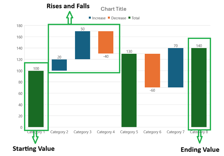
Waterfall Chart in PowerPoint
**
Step-by-Step Guide to Creating a Waterfall Chart in PowerPoint
Step 1: Prepare Your Data
Before you dive into PowerPoint, organize your data. The key to an effective Waterfall Chart is the correct structure. Your data should be arranged in a table, with categories, positive/negative values, and cumulative totals.
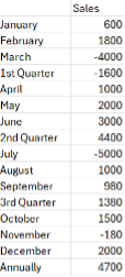
Ensure the increments and decrements are clearly defined.
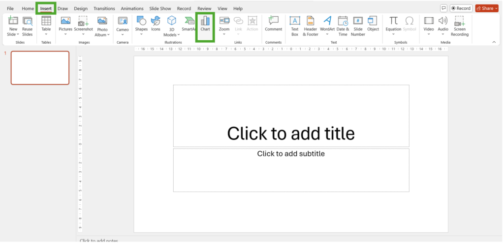
Step 2: Click on the Insert tab, then select Chart.
From the Chart menu, choose Waterfall.
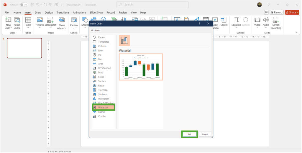
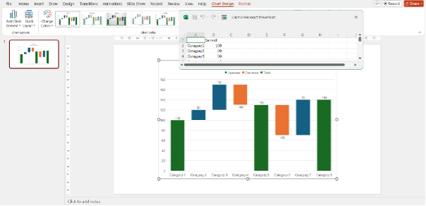
A sample waterfall chart gets created that looks something like below:
Step 3: Input the Data
Replace the default data with your own, ensuring that each column represents a stage of the process (e.g., starting value, individual changes, final value). This basically means you copy the data on the excel window pop up that opens up on PowerPoint.
Pro tip: To add negative value(loses) add ‘–’ before the value
Step 4: Select Data
As you can see, not all the data has been represented in the chart. Unlike other charts where you can drag the colorful box in Excel, Waterfall charts have a different process.
Since the waterfall chart works differently from other types, you won’t be able to edit data ranges directly on the chart. Go to Chart Design > Select Data.

In the dialog box, click the upward-facing arrow to select the range of cells in the embedded Excel sheet that contains your data.
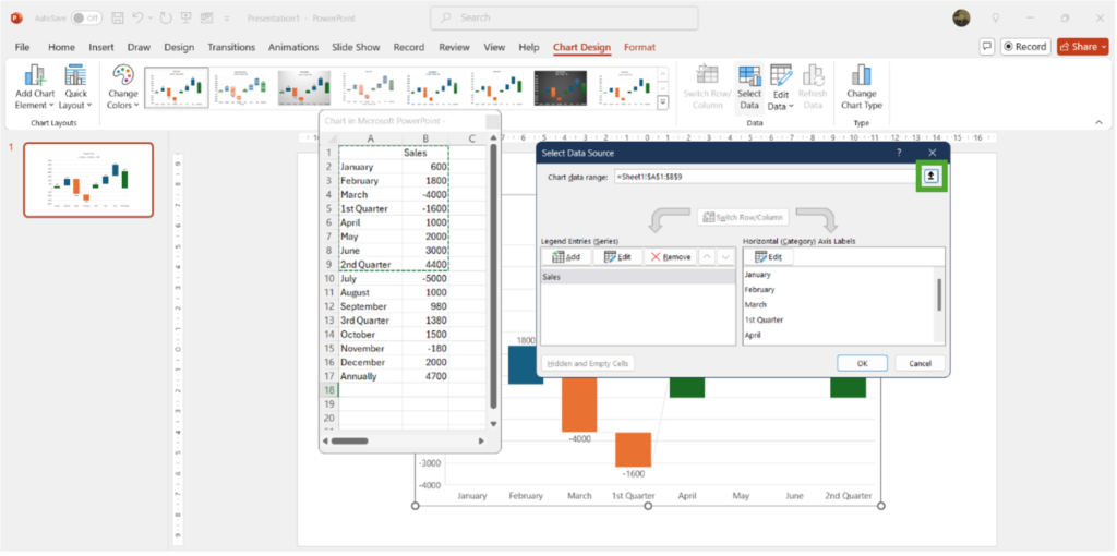
Drag over your dataset, click the downward arrow, and press OK.

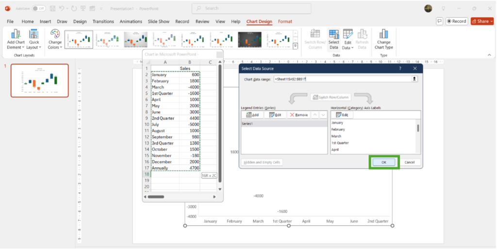
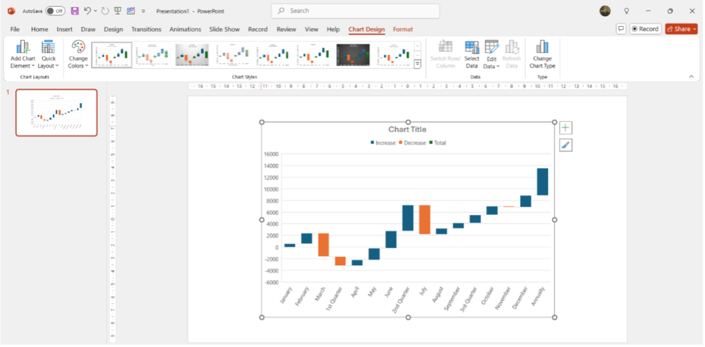
(The chart displays your entire data)
Step 5: Set Subtotals and Totals
A key feature of waterfall charts is the ability to designate certain data points as subtotals or totals.
Set as Total
Click once to select the chart, then click again to highlight the data point that should be a subtotal or total.
Right-click and select Set as Total from the menu.

The final Waterfall chart looks like below, notice how the total and sub-total values are in green color from the baseline of 0. Notice that the first quarter sub-total in negative but it becomes positive in the second quarter.

(Final data)
Clear Totals
If you mistakenly designate a data point as a total, right-click it again and choose Clear Total.
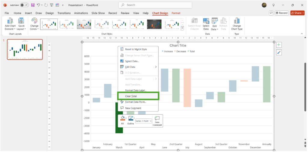
(Final Data)
**
Making a Dynamic Waterfall Chart in PowerPoint
Currently, your data is in hardcore form, if you change the data in any of the categories the subtotals and totals in the chart will not adjust accordingly.
(Changing the value of February and the 1st quarter as well as over all sales do not add up)
To make the chart dynamic (i.e., so that it updates automatically when you change the underlying data), go back to the Excel sheet by clicking on Edit Data in the Chart Design tab
Use the SUM function for subtotals and totals.
Example: In a cell for a subtotal, enter =SUM(B2:B5) to automatically calculate the sum of that range. To enter the cells, you can either enter the cell address or drag your mouse over the cells you wish to add.
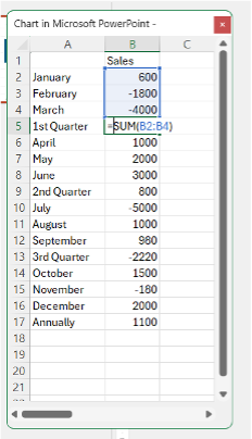
Once the formulas are in place, update the data to ensure the chart reflects changes. For instance, if a value becomes negative, the chart should automatically adjust.

Pro Tip: If your category names are too long, use Excel’s Alt + Enter shortcut to insert line breaks in the labels.
**
Customizing and Enhancing Your Waterfall Chart in PowerPoint
Quick Access Tools
The quick access tools beside a chart in PowerPoint are a set of convenient icons that appear when you select a chart. These tools provide quick and easy access to some of the most commonly used chart customization options.
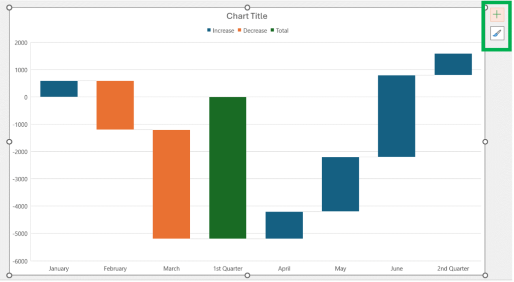
1. Chart Elements (Plus Sign Icon)
This tool allows you to add, remove, or modify various chart elements such as titles, labels, gridlines, and more.
a) Click on the plus sign icon to open the Chart Elements menu.
b) Check or uncheck the boxes to add or remove elements from your chart.
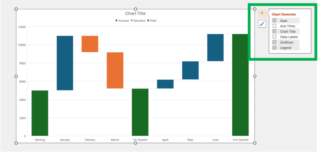
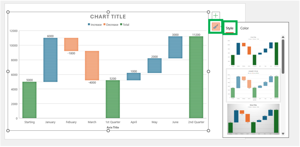
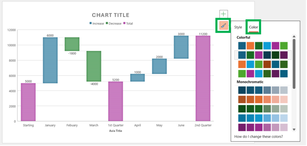
2. Chart Styles (Paintbrush Icon)
This tool provides a quick way to change the visual style of your chart, including colors and overall design.
a) Click on the paintbrush icon to open the Chart Styles menu.
b) Browse through the available styles and select one to apply it to your chart.
c) Switch between the “Style” and “Color” tabs to adjust the chart’s overall design or color scheme separately.
**
Chart Layouts Group
Add Chart Element: Allows you to add or modify chart elements. The options here were also similar to the Chart Elements section under Quick Access Tools. We are describing the options in detail here.

The Chart elements are:
1. Axes: Allows you to add or modify the horizontal and vertical axes of the chart.

2. Axis Titles: Allows you to add or edit titles for the horizontal and vertical.
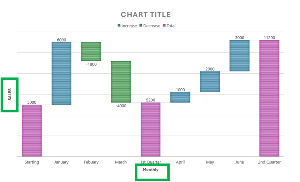
3. Chart Title: Lets you add or edit the main title of the chart.

4. Data Labels: Adds labels to your data points, showing the exact values of the data.
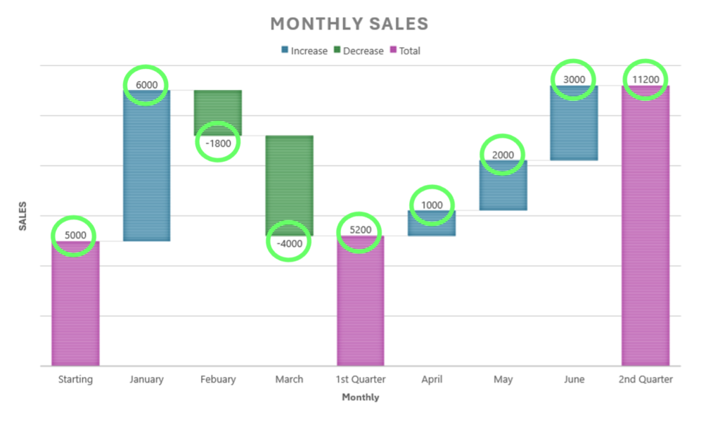
5. Gridlines: Adds or modifies gridlines in the chart for better readability. You can add primary major, primary minor, secondary major, and secondary minor gridlines.
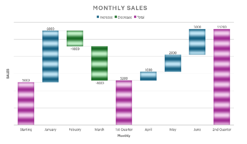
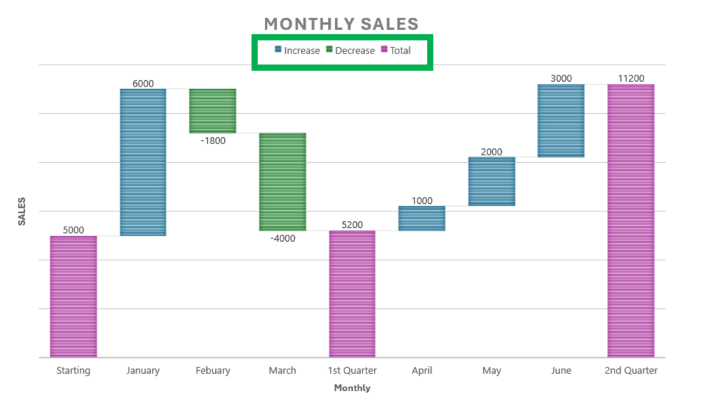
6. Legend: Adds or modifies the chart legend, which helps identify the data series.
**
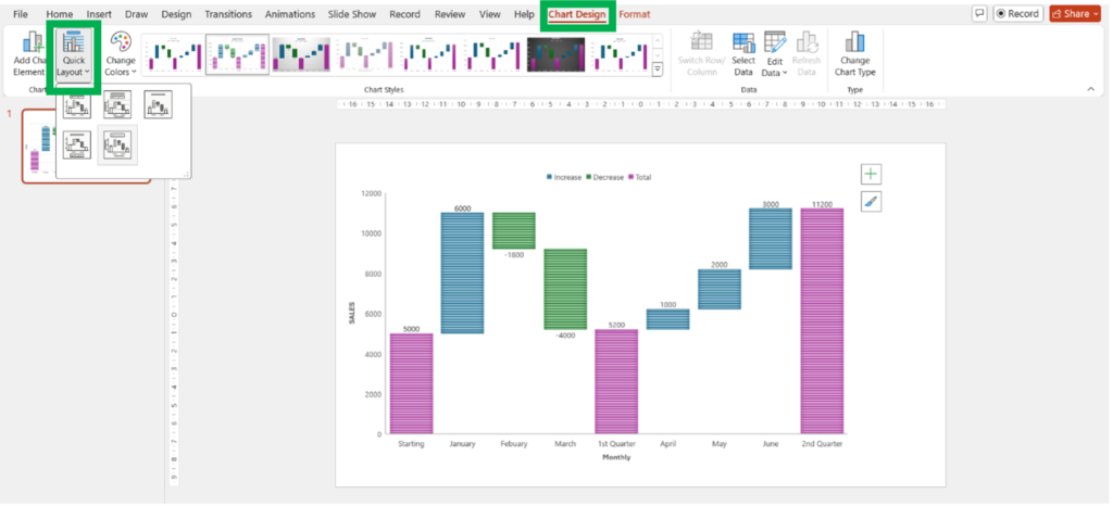
Quick Layout
Offers predefined chart layouts that combine various chart elements in a specific configuration.
Chart Styles Group
Change Colors: Provides a palette of color schemes to apply to your chart.

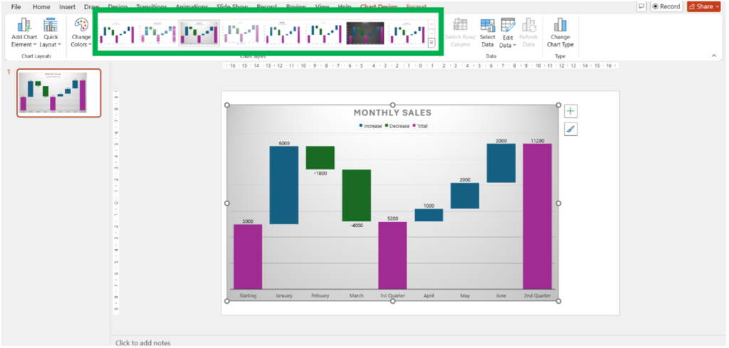
Chart Styles: Offers a gallery of predefined chart styles that you can apply to your chart to quickly change its appearance.
Conclusion
Waterfall Chart in PowerPoint are powerful tools for visualizing changes over time, making them an essential part of many business presentations. Remember, clarity is key—ensure your chart is easy to read, visually appealing, and tells a clear story to your audience. Try experimenting with different customization options to find what works best for your data.


