A picture truly is worth a thousand words—especially in business presentations. Whether you’re showcasing sales trends or highlighting key performance metrics, well-designed PowerPoint charts and graphs can make complex data more accessible and engaging.
PowerPoint Charts & Graphs
Charts and graphs transform raw data into visual stories. They simplify complex information, making it easier for your audience to grasp key insights at a glance. From annual sales reports to project timelines, the right chart can highlight trends, patterns, and correlations that might otherwise go unnoticed.
Types of PowerPoint Charts and Graphs
PowerPoint offers a variety of chart types, each suited for different kinds of data:
- Column Chart: Displays data using rectangular bars where the length of the bar is proportional to the value it represents.
- Line Chart: Represents data points connected by a straight line, showing trends over time.
- Pie Chart: Circular chart divided into sectors, each representing a proportion of the whole.
- Bar Chart: Similar to column charts but uses horizontal bars instead of vertical ones.
- Area Chart: Similar to line charts, the area under the line is filled with color to represent volume.
- X Y (Scatter) Chart: Plots points using Cartesian coordinates, showing the relationship between two variables.
- Map Chart: Displays geographical data on a map.
- Stock Chart: Designed for financial data, showing stock performance with values like high, low, open, and close.
- Surface Chart: Displays a 3D surface that shows the relationship between large amounts of data.
- Radar Chart: Shows multiple data series on a spider web-like chart, where each axis represents a variable.
- Treemap Chart: Represents hierarchical data using nested rectangles.
- Sunburst Chart: Displays hierarchical data as concentric circles.
- Histogram Chart: Shows the distribution of data by grouping it into ranges.
- Box & Whisker Chart: Shows statistical data distribution using quartiles and medians.
- Waterfall Chart: The Waterfall Chart in PowerPoint displays the cumulative effect of sequentially introduced positive or negative values.
- Funnel Chart: Represents data that progressively diminishes, forming a funnel shape.
- Combo Chart: Combines two or more chart types in a single chart, such as a line and column chart.
**
How to Insert Charts and Graphs in PowerPoint?
- Go to the Insert tab on the Ribbon. Click on Chart in the Illustrations Group.
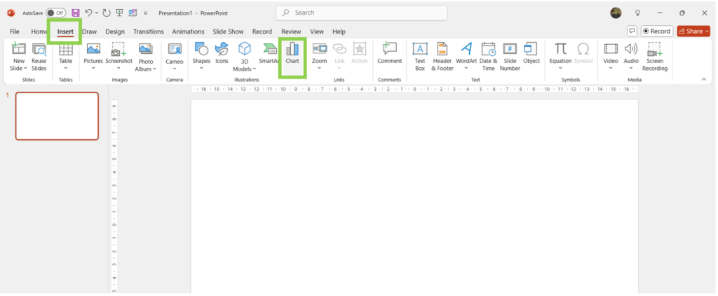
- Choose your desired chart type from the dialog box and click OK.
- In the worksheet that appears, replace the placeholder data with your own information.
**
How To Format PowerPoint Charts and Graphs?
Quick Access Tools
The quick access tools beside a chart in PowerPoint are a set of convenient icons that appear when you select a chart. These tools provide quick and easy access to some of the most commonly used chart customization options.
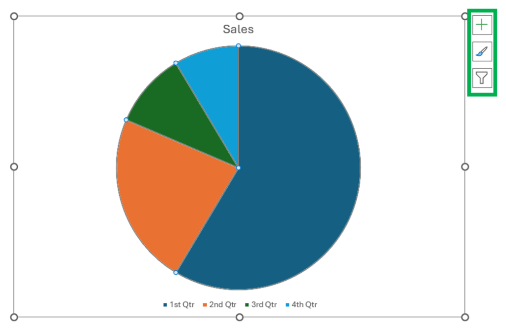
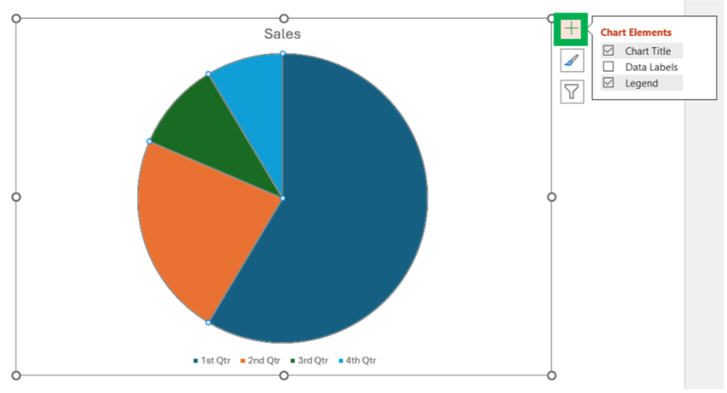
1. Chart Elements (Plus Sign Icon)
This tool allows you to add, remove, or modify various chart elements such as titles, labels, gridlines, and more.
- Click on the plus sign icon to open the Chart Elements menu.
- Check or uncheck the boxes to add or remove elements from your chart.
- Use the arrows next to each element to access more options, such as positioning or formatting specific elements
2. Chart Styles (Paintbrush Icon)
This tool provides a quick way to change the visual style of your chart, including colors and overall design.
- Click on the paintbrush icon to open the Chart Styles menu.
- Browse through the available styles and select one to apply it to your chart.
- Switch between the “Style” and “Color” tabs to adjust the chart’s overall design or color scheme separately.
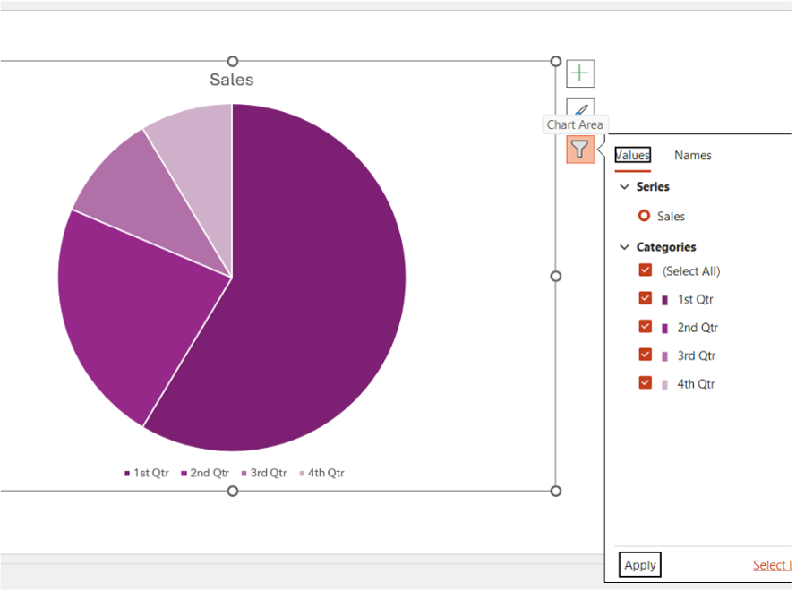
3. Chart Filters (Filter Icon)
This tool allows you to filter the data displayed in your chart, helping you focus on specific data points or series.
- Click on the filter icon to open the Chart Filters menu.
- Use the checkboxes to select or deselect data series or categories you want to include or exclude from the chart.
- Click “Apply” to update the chart based on your selections.
**
Formatting Charts in PowerPoint
Select the Chart: click on the chart to select it. This will automatically bring up the Chart Design and Format tabs on the ribbon.
Functions in the Chart Design Tab
1. Chart Layouts Group
- Add Chart Element: Allows you to add or modify chart elements
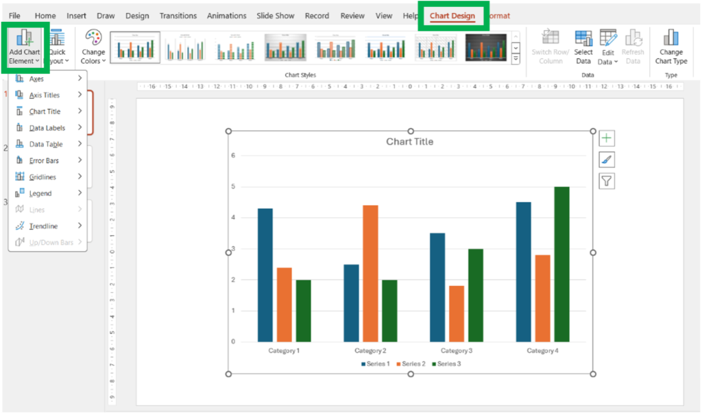
Chart elements are:
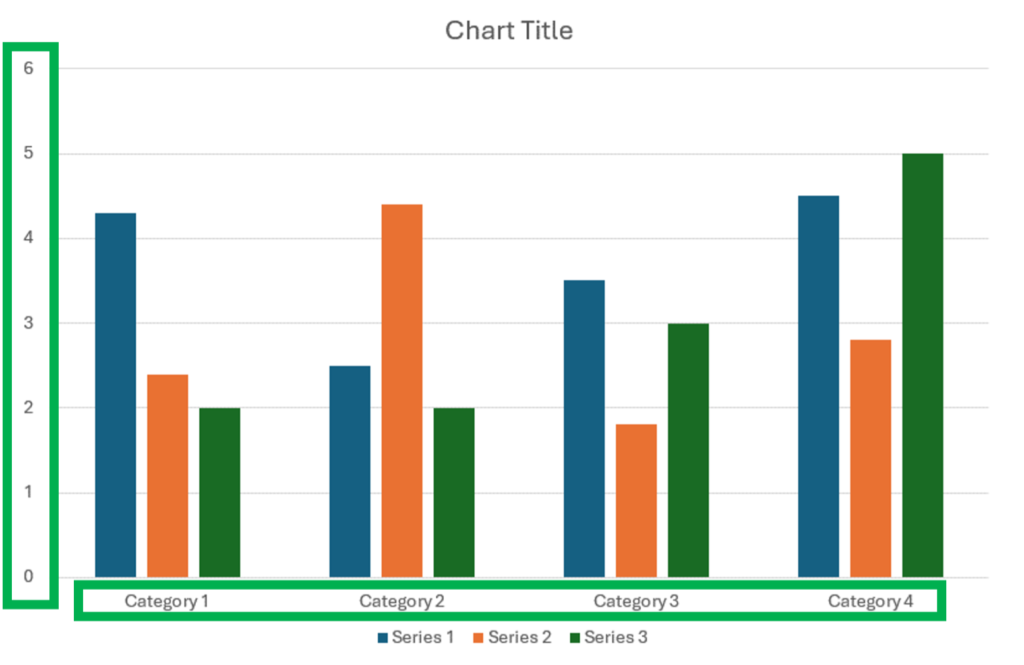
- Axes: Allows you to add or modify the horizontal and vertical axes of the chart.
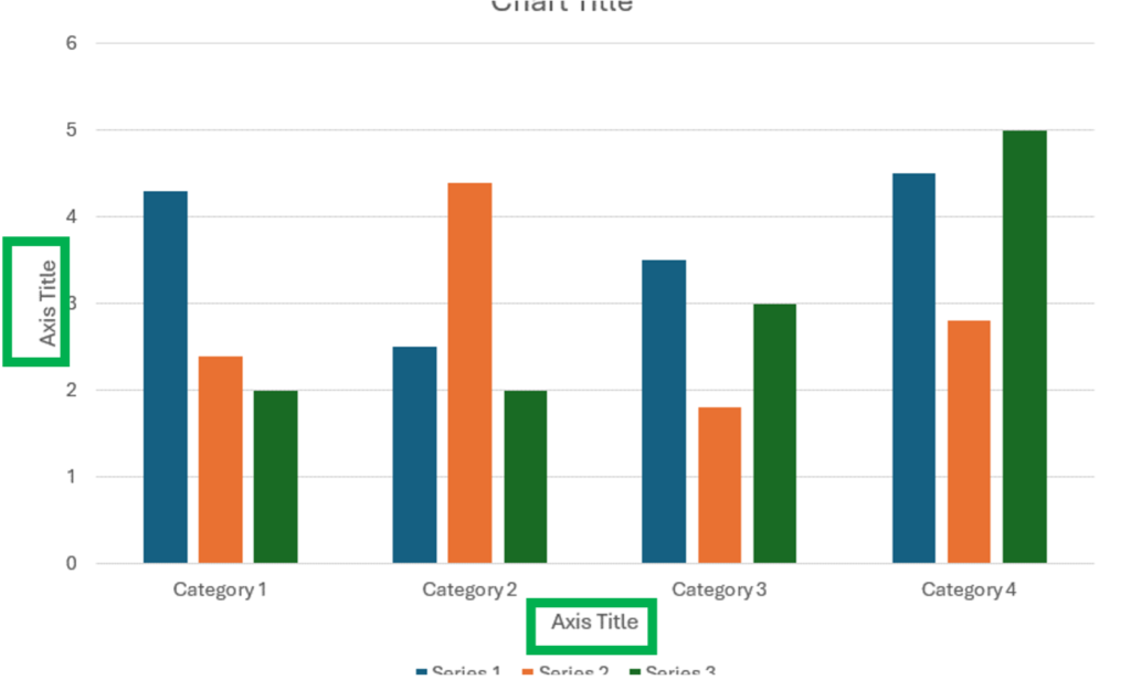
- Axis Titles: Allows you to add or edit titles for the horizontal and vertical.
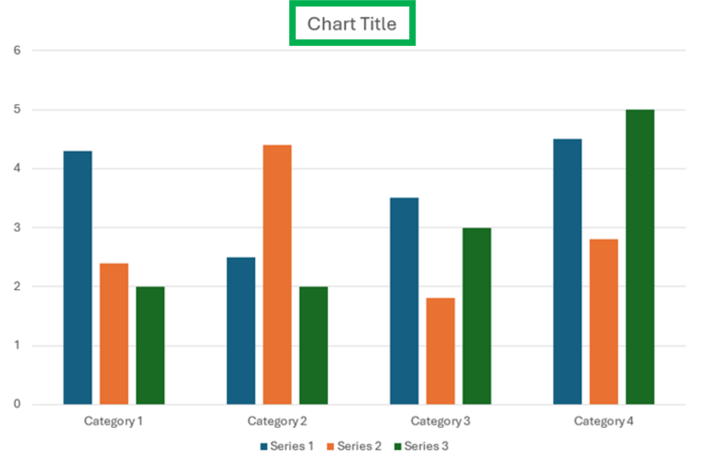
- Chart Title: Lets you add or edit the main title of the chart.
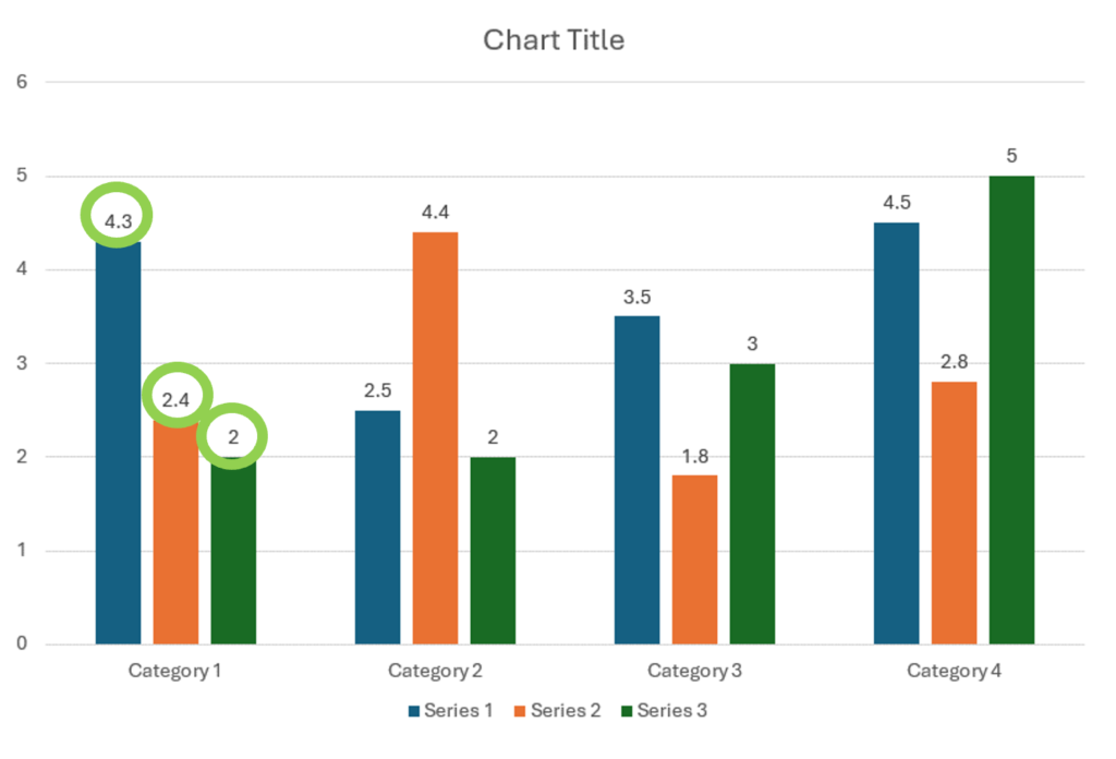
- Data Labels: Adds labels to your data points, showing the exact values of the data.
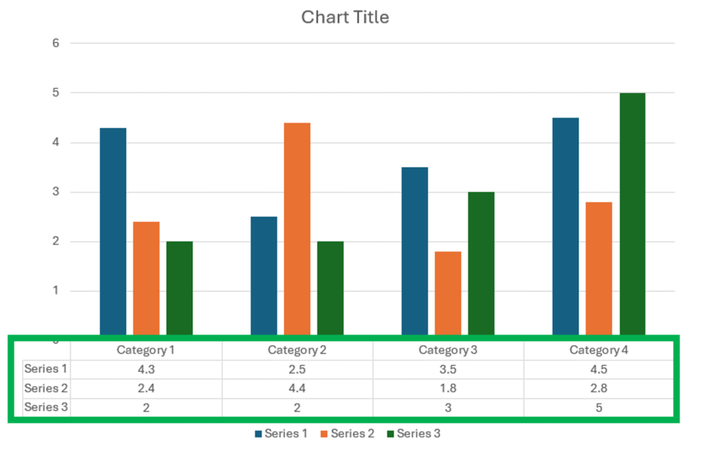
- Data Table: Displays a data table at the bottom of the chart, showing the values in a table format.
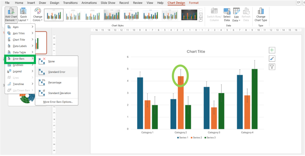
- Error Bars: Adds error bars to your chart to show variability in data.
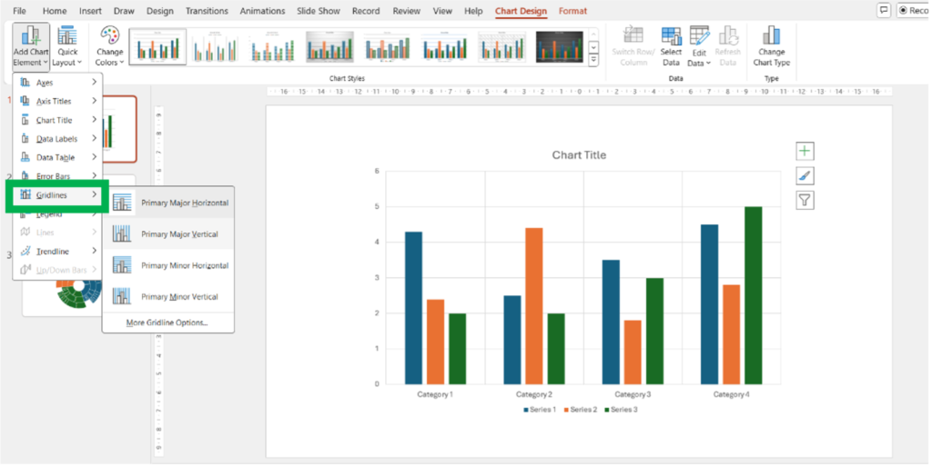
- Gridlines: Adds or modifies gridlines in the chart for better readability. You can add primary major, primary minor, secondary major, and secondary minor gridlines.
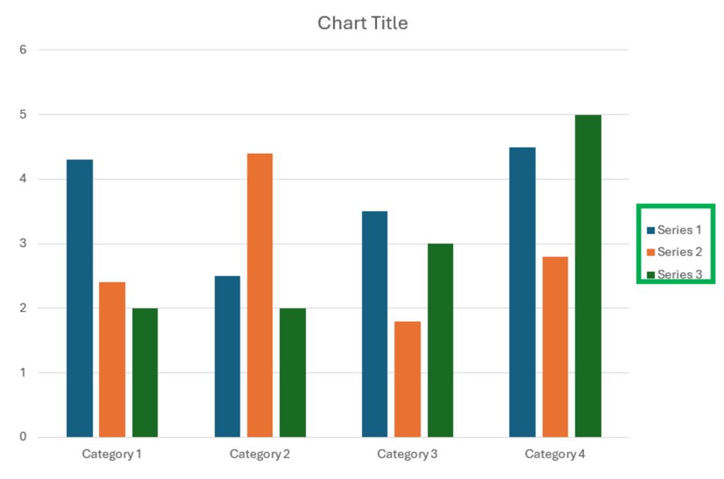
- Legend: Adds or modifies the chart legend, which helps identify the data series.
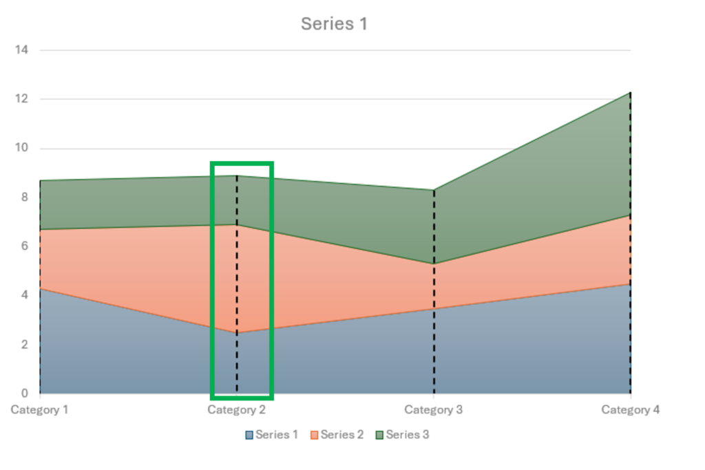
- Lines: Adds lines such as drop lines, high-low lines, and up/down bars to your chart to enhance its visual representation.
- Trendline: Adds a trendline to your chart, which shows the general direction of the data.
- Up/Down Bars: Adds bars that highlight the difference between two data series.
**
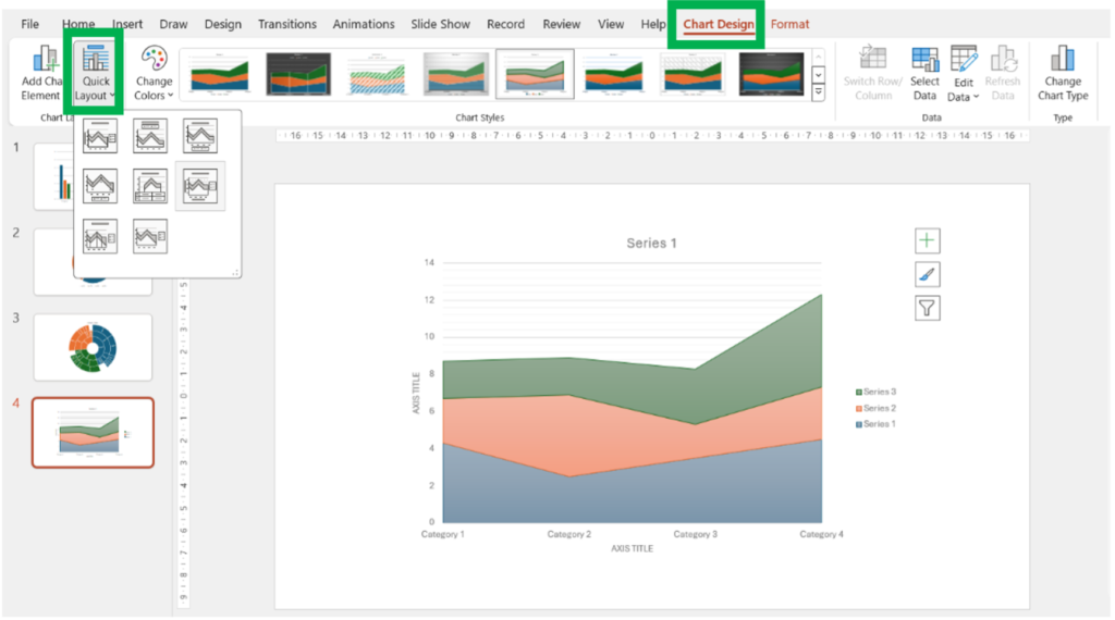
- Quick Layout: Offers predefined chart layouts that combine various chart elements in a specific configuration.
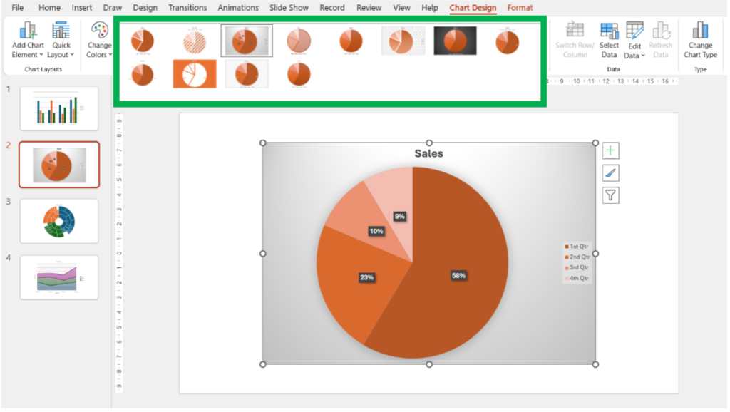
2. Chart Styles Group
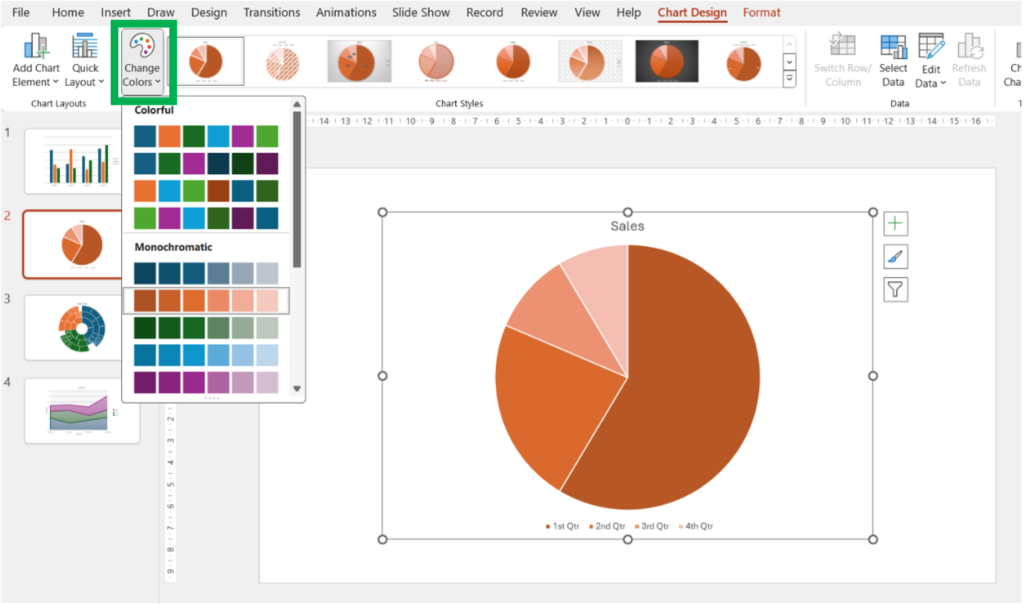
- Change Colors: Provides a palette of color schemes to apply to your chart.
- Chart Styles: Offers a gallery of predefined chart styles that you can apply to your chart to quickly change its appearance.
**
3. Data Group
- Select Data: Opens the Select Data Source dialog box, allowing you to modify the data range and series used in the chart.
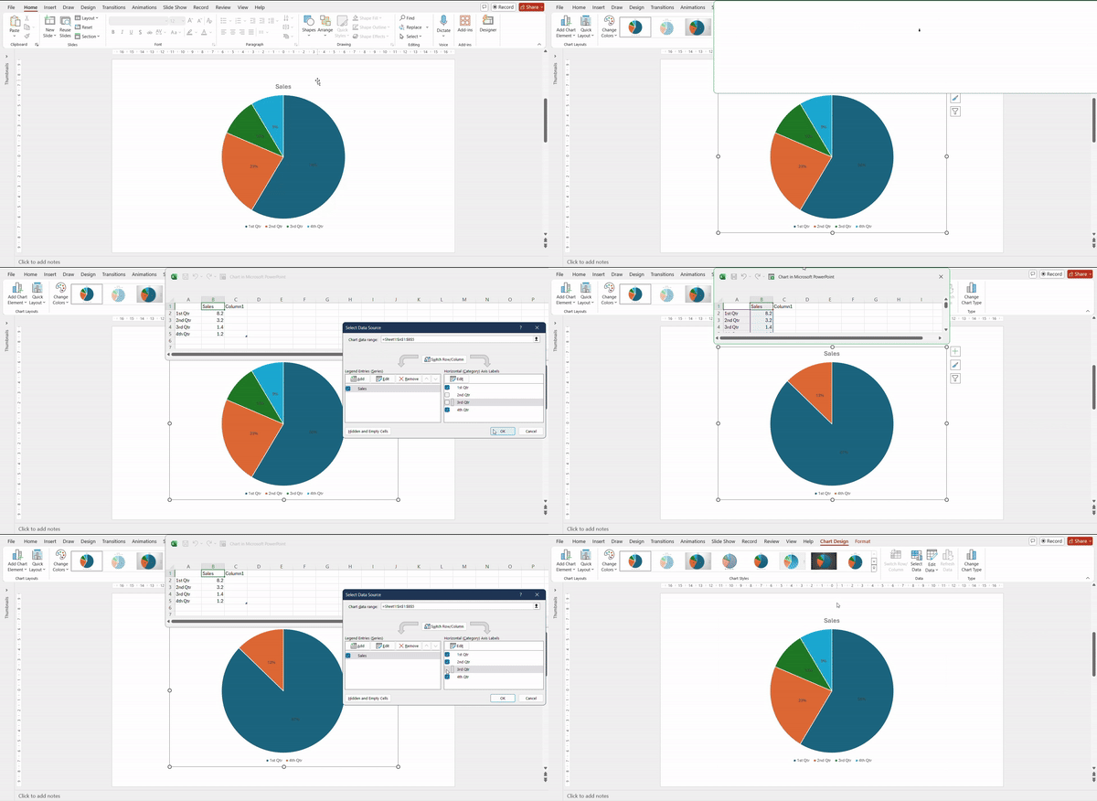
- Switch Row/Column: Toggles the chart’s data orientation, swapping the row and column data.
- Edit Data: Opens the worksheet, allowing you to edit your data.
4. Type Group
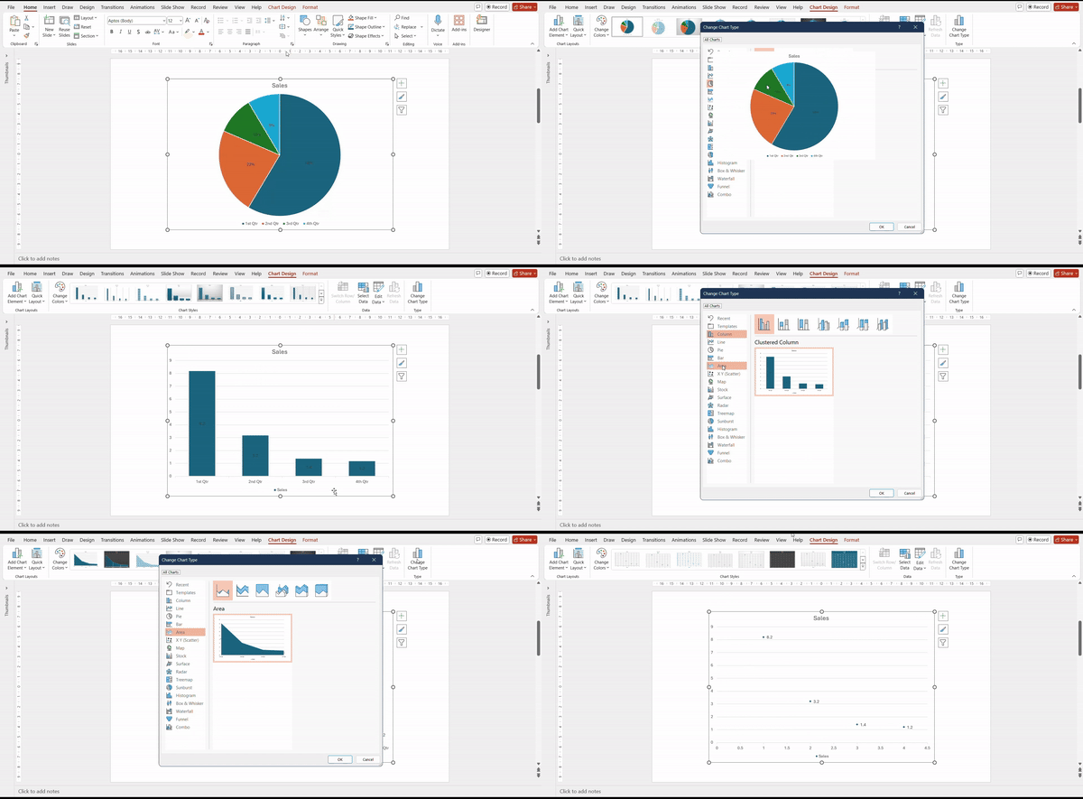
- Change Chart Type: Opens the Change Chart Type dialog box, allowing you to switch to a different type of chart (e.g., from a Column chart to a Line chart).
**
Additional PowerPoint Charts Tools
While the above groups cover the primary functions within the Chart Design tab, you can also customize your chart using the Format tab that appears alongside the Chart Design tab.
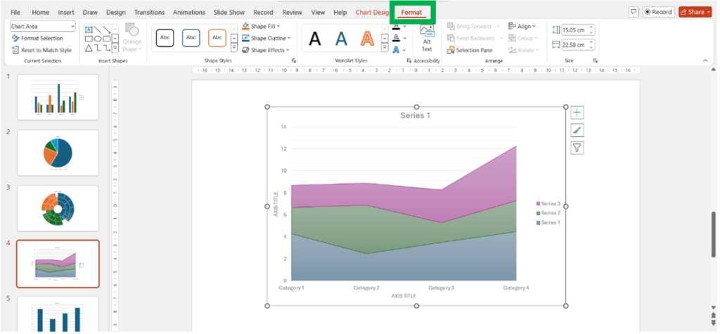
The Format tab allows you to:
- Format Selection: Apply specific formatting to selected chart elements.
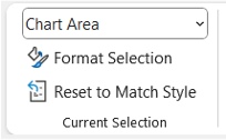
- Shape Styles: Change the style of shapes within the chart.

- WordArt Styles: Apply text effects to chart titles and labels.
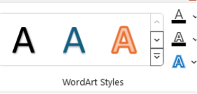
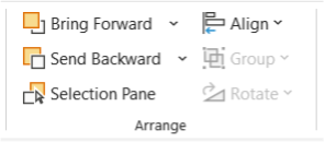
- Arrange: The arrange objects function adjusts the layering and alignment of chart elements.
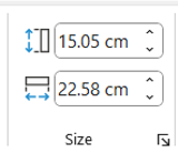
- Size: Change the size of the chart or specific chart elements.
Conclusion
PowerPoint offers a diverse range of chart types, each serving different purposes to effectively visualize data. From comparing categories with bar and column charts to analyzing trends with line charts and representing hierarchical data with sunburst charts, the flexibility PowerPoint charts ensures you can tailor your visuals to your specific needs. Whether you’re comparing performance metrics with a radar chart or breaking down a process with a funnel chart, PowerPoint’s built-in tools give you everything you need to create visually appealing and insightful presentations. Start exploring these chart types in your presentations to make data-driven insights more compelling and easier to grasp.


